In This Topic
Simple
Create a bubble plot that displays the data values for a pair of variables at their (x, y) coordinates using symbols that vary in size according to a third variable. For example, the following bubble plot shows the relationship between Total Volume (Y), Combined MPG (fuel efficiency) (X), and Retail cost (bubble size) for automobiles.
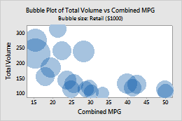
For more information, go to Create a simple bubble plot.
With Groups
Create a bubble plot that displays the data values for a pair of variables at their (x, y) coordinates using symbols that vary in size according to a third variable, and with different colors to represent separate groups. For example, the following bubble plot shows the relationship between Total Volume (Y), Combined MPG (fuel efficiency) (X), and Retail cost (bubble size) for automobiles, grouped by safety rating.
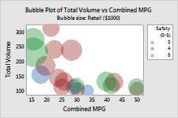
For more information, go to Create a bubble plot with groups.