In This Topic
Step 1: Look for model relationships and assess the strength
Look for model relationships between pairs of variables. Determine which model relationship best fits your data and assess the strength of the relationship. If a model fits well, you can use the regression equation for that model to describe your data.
Tip
To see how well a particular model fits your data, add a fitted regression line. Double-click the graph. With the graph in editing mode, right-click the graph, then choose . You can hold the pointer over the fitted regression line to see the regression equation.
Type of relationship
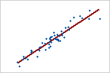
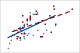
Linear: positive
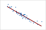
Linear: negative
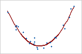
Curved: quadratic
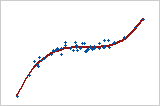
Curved: cubic
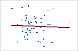
No relationship
If your data seem to fit a model, you can explore the relationship using a regression analysis.
Strength of relationship
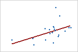
Weaker relationship
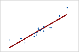
Stronger relationship
To quantify the strength of a linear (straight) relationship, use a correlation analysis.
Step 2: Look for group-related patterns
If your matrix plot has groups, you can look for group-related patterns. Look for differences in x-y relationships between groups of observations. Even if you didn't include a grouping variable in your graph, you may be able to identify meaningful groups. Finding meaningful groups can help you describe your data more precisely.
The following graphs are examples of group related patterns.
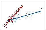
- Groups with different slopes
- When a group has a steeper slope, changes in x-values are associated with
greater changes in y-values.
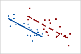
- Groups with different locations
- One group has consistently higher y-values for each specific value of x than the
other group.
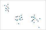
- Groups in clusters
- The three clusters in this scatterplot indicate three groups.
- No group-related pattern
- These two groups don't seem to be different.
If you suspect that your data contain groups, you can add a grouping variable to your graph to visualize the groups. Double-click a data point and select the Groups tab.
Step 3: Look for other patterns
Outliers may indicate unusual conditions in your data. Time-based trends may indicate changing data conditions.
Outliers
Outliers, which are data values that are far away from other data values, can strongly affect your results.
On a scatterplot, isolated points identify outliers.
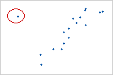
Try to identify the cause of any outliers. Correct any data entry or measurement errors. Consider removing data values that are associated with abnormal, one-time events (special causes). Then, repeat the analysis.
Time-based trends
If the X variable contains a sequence of time or date values recorded in order, look for time-based trends. To add connect a line to your scatterplot, double-click the graph. With the scatterplot in editing mode, right-click the graph, then choose and select Connect Line.
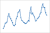
Cycling trend
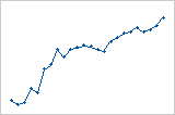
Increasing trend
Note
If you collected data in equally-spaced time intervals, you can use a time series plot.