Report 1: Executive Summary
- Process Performance top plot: Static process performance LT/ST
- Process Performance bottom plot: Dynamic process performance LT/ST
- Process Demographics
- Process Benchmarks
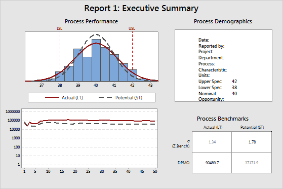
Process Performance top plot: Static process performance LT/ST
The normal curves on the histogram display the estimated distribution of the measurements of the project CTQs. CTQ (critical to quality) refers to the primary measurable characteristics of a product or process whose performance standards must be met in order to satisfy the customer. CTQs can include any variable that is related to the product or service, and can have the upper and lower specification limits.
Minitab calculates these curves from the long-term (LT) and short-term (ST) estimates of the process mean and process standard deviation. Minitab then draws a LT normal curve and a ST normal curve. In almost all cases, the LT normal curve is wider than the ST normal curve.
The specification limits (LSL and USL) provide points of reference. The target value (nominal value) is usually, but not always, centered between the lower and upper specification limits. Ideally, the mean should be close to the target value. In the example above, the process mean appears to be very close to the target value.
Note
Minitab calculates the LT normal curve from the process mean. For more information on the ST normal curve, go to How Minitab chooses centering values for short-term statistics for Process Report.
Process Performance bottom plot: Dynamic process performance LT/ST
This plot displays the estimated cumulative DPMO (defects per million opportunity) after each subgroup of data, for both LT (long-term) and ST (short-term). Minitab calculates the DPMO by first obtaining a Z.Bench after each subgroup, then converts it into a DPMO. The Z.Bench values are functions of the estimated mean and standard deviation, for both LT and ST.
If the process is stable, then the lines in this plot approach a steady value. If the lines are not stabilizing, either the process is not stable, or there is not enough data. In the example above, both lines tend to fluctuate on the left side of the plot, but then stabilize on the right side of the plot. If the lines were relatively flat on the left side of the plot, then increase or decrease in constant manner. This indicates that something in the process might have changed: either the mean has shifted, or there has been a change in process variation. In almost all cases, the LT line is above the ST line, because the LT Z.Bench is smaller than the ST Z.Bench, due to the influence of process shift and drift.
Both lines on this plot should oscillate up and down on the left side, where there are few subgroups, but should stabilize on the right side if enough data have been collected and the process is stable. If the lines do not stabilize, the plots in Report 4: Cumulative Statistics should help you determine whether the problem is not enough data or a process instability.
Process Demographics
The demographics table shows the project information and the process information that you specify.
Process Benchmarks
- Sigma (or Z.Bench), both LT and ST
- DPMO, both LT and ST
The numbers in bold are ST Sigma (or Z.Bench) and LT DPMO. Most Black Belts report process performance using these two values.
Report 2: Process Capability
- Control charts of the process data
- Capability plots LT/ST
- Capability indices LT/ST
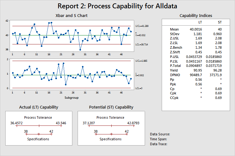
Control charts of the process data
Displays process stability over the time that the data were collected. For subgroups larger than 1, use an Xbar chart to help determine stability of the process mean and an S chart to help determine stability of the process standard deviation. If subgroup size = 1, Minitab displays an I chart and an MR chart.
Capability plots LT/ST
Displays the estimated process tolerance relative to the specification limits. The process tolerance is the process centering point ± 3 standard deviations. There are two plots because the process centering point and the process standard deviation are different for LT and ST. LT uses the process mean as the centering point, while ST uses the target (or mid-point between specifications, or the process mean when only one specification is given) as the centering point. See How Minitab chooses centering values for short-term statistics for Process Report for more information.
In other words, these graphs show whether a car (the process) will fit into a garage (the specifications), or for that matter whether the car is even aimed at the garage. In the example above, the process is wider than the specifications. However, the process is centered, as illustrated on the LT plot, which shows that the process centering point (mean) as almost the same as the target.
Capability indices LT/ST
Displays the statistics commonly used to report on process performance. See Understanding capability measures for a discussion comparing statistics measuring long-term (LT) and short-term (ST) performance.
Use the Z.Bench values to describe process performance. Not only are the Z.Bench statistics based on the appropriate process conditions, but they also lead directly to estimates of the probability of a defect: PPM, DPMO, and so on. Acceptable alternatives are CCpk and Ppk, because they are based on the same process conditions as the Z.Bench statistics.
For more information on specific calculations, go to Calculations for process statistics and capability values for Process Report.
Report 3: Process Statistics

Basic Statistics
This table provides the process mean (LT mean), the process standard deviation (LT standard deviation), and other basic statistics.
Use skewness and kurtosis to help determine whether the data are normally distributed. However, probability plots are much more useful. (On Report 6, the Normal Plot estimates the probability of a defect.)
The minimum, 1st quartile, median, 3rd quartile, and maximum show the spread of the data. For example, 25% of the data are not larger than 39.1540 (1st quartile), 50% of the data are not larger than 40.0381 (median), and 75% of the data are not larger than 40.8249 (3rd quartile).
Advanced Statistics
This table provides statistical inferences for the process parameters, the ST mean, and the standard deviation.
The process mean includes a 95% confidence interval and test statistics to show whether the process mean is equal to the process target. If the process mean and the process target have no statistically significant difference, then the p-value will be > 0.05, and the process target will be within the bounds of the confidence interval. In the example above, the test has a p-value of 0.9830 and the target (40) is within the bounds of the 95% confidence interval for the mean. You cannot reject the null hypothesis that the process mean is equal to the process target.
The table also provides 95% confidence intervals for both LT and ST standard deviations, and a test to see whether these two quantities are equal. If a statistically significant difference between the LT and ST process standard deviations does not exist, then you can conclude that the process does not exhibit significant shift and/or drift and that no special causes were present when the data were collected. In the example above, the test for equal variances has a p-value of 0.0011. Thus, you must reject the null hypothesis, and conclude that the LT standard deviation and the ST standard deviation are significantly different.
Report 4: Cumulative Statistics
The Cumulative Statistics helps you verify the assumption of a stable process (fairly constant mean and variance).
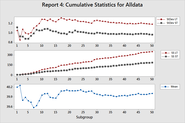
Cumulative StDev LT/ST
This plot displays the estimates of both the LT standard deviation and the ST standard deviation after each subgroup of data. Because all the measures of process performance are based on estimates of the standard deviation of the process, you should determine whether these estimates are appropriate. Their appropriateness depends on having a stable process (a process in which the inherent variability is not changing) and enough data to adequately characterize the process.
The estimates of the LT standard deviation and the ST standard deviation should oscillate considerably on the left side of the plot, which contains few subgroups. If the process is stable and you collected enough data, then the estimates will stabilize on the right side of the plot. If the lines on the plot continue to oscillate, then either you did not collect enough data or the process variation is unstable.
For a stable process, the gap between the LT standard deviation and the ST standard deviation should become fairly constant. If the process changes, such as a shift in the mean or a change in variation, then the gap between the LT standard deviation and the ST standard deviation changes.
For more information, go to Identifying process mean shifts with Process Report, and Identifying an increase in process variability with Process Report.
Cumulative SS LT/ST
This plot displays both the sum of squared deviations (SS Total or SS LT) after each subgroup of data and the sum of all squared deviations within each subgroup (SS Within or SS ST) after each subgroup of data. For more information, go to Calculations for sums of squares for Process Report.
SS ST is a very good diagnostic tool for detecting changes in the inherent variation of a process. If the inherent variation is stable, then the SS Within for each subgroup will be approximately the same. Thus, the SS ST should increase by about the same amount for each subgroup, which results in an SS ST line that has a constant upward slope. Any change in the inherent variability of the process is shown as a change in the slope of the SS ST line.
SS Total is the sum of SS Within and SS Between. Thus, SS Total is affected by the stability of both the process variance and the process mean. If both are stable, then the contribution to SS Total will be approximately the same for each subgroup. Thus, the SS LT should increase by approximately the same amount for each subgroup, which results in an SS LT line that has a constant upward slope. Any change in the inherent variability of the process is shown as a change in the slope of the SS LT line.
A sudden change in the inherent process variability affects both SS Within and SS Between and changes the slopes of both the SS ST and SS LT lines. Thus, a change in slope for both lines indicates a change in the inherent process variability.
A process mean shift affects SS Between, but not SS Within, and changes the slope of the SS LT line but not of the SS ST line. Thus, a change in the slope of the SS LT line, along with no change in the slope of the SS ST line, indicates a shift in the process mean.
For more information, go to Identifying process mean shifts with Process Report, and Identifying an increase in process variability with Process Report.
Cumulative mean
This plot displays the estimate of the process mean after each subgroup. The adequacy of the estimate of the process mean depends on the amount of data that you collected and the stability of the process.
The estimates should oscillate up and down considerably on the left side of the plot, which contains few subgroups. If the process is stable and you collected enough data, then the estimates will stabilize on the right side on the plot. If the lines continue to oscillate, then either you did not collect enough data or the process mean is drifting dramatically. Look at the cumulative StDev plot to determine whether the problem is that you do not have enough data. If you do not have enough data, then the LT and ST lines will also oscillate.
Report 5: Cumulative Benchmarks
The Cumulative Benchmarks report displays the Z.Shift statistic and the Z.Bench statistics (LT and ST) after each subgroup.
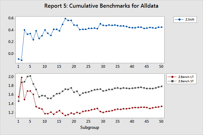
Z.Shift
Z.Shift is equal to the gap between Z.Bench LT and Z.Bench ST.
The line on this plot should oscillate up and down on the left side, which contains few subgroups, but should stabilize on the right side if you collected enough data and the process is stable.
Z.Bench LT, and Z.Bench ST
The Z.Bench plot indicates whether you collected enough data to confidently use these statistics to report process performance. Both lines on this plot should oscillate up and down on the left side, which contains few subgroups, but should stabilize on the right side if you collected enough data and the process is stable. If the lines do not stabilize, then the plots in the Cumulative Statistics report can help you determine whether the problem is you do not have enough data, or process instability.
Both the gap in the Z.Bench plot and the line in the Z.Shift plot should approach a constant value, as they do in the example above.
Report 6: Performance Diagnostics
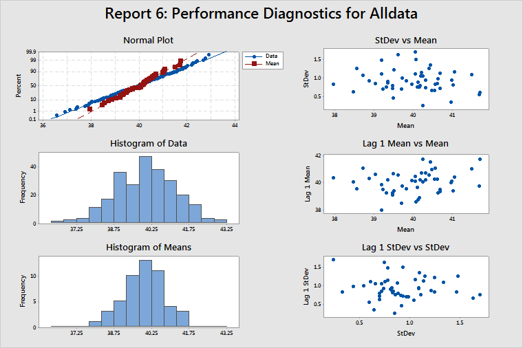
Normal Plot, Histogram of Data, and Histogram of Means
These plots help you determine whether your data are normal. If your data are nonnormal, then estimates of the probability of a defect (such as DPMO) will not be accurate. In most cases, these estimates tend to be lower than the actual values. So check the normal plot and the two histograms to see whether the data are at least reasonably normal before using any estimates such as DPMO. The data in the example above appear to be normally distributed.
If the data appear to be badly skewed, try a transformation such as the Box-Cox transformation, to correct the problem. When you choose Use Box-Cox power transformation (W=Y^λ) with on the Process Report Options sub-dialog box, Minitab automatically transforms the data, the target, and the specification limits. However, if you manually transform the data, you must also manually transform the target and the specification limits.
StDev vs Mean
When no correlation between subgroup means and subgroup standard deviations is present, this plot should display randomly scattered points, as in the example above.
If a positive correlation between the means and standard deviations is present, then the subgroup standard deviations tend to increase as the subgroup means increase. The Box-Cox transformation (λ = 0) is a well-known variance-stabilizing transformation that usually works well in these cases.
Lag 1 Mean vs Mean
Lag 1 Mean vs Mean is a plot of (the mean for subgroup)i versus (the mean for subgroup)i–1. This plot should display randomly scattered points, as in the example above, which indicates that no correlation between successive subgroup means is present.
If a positive correlation is present and one subgroup mean is larger than the overall process mean, then the next subgroup mean is also likely to be larger than the overall process mean. Thus, a positive correlation implies that the process is subject to drifting in the mean. If the correlation is negative, this would indicate alternating subgroup means—low, then high, then low—not two consecutive low subgroup means. This negative correlation implies over control of the process.
Lag 1 StDev vs StDev
Lag 1 StDev vs StDev is a plot of (the standard deviation for subgroup)i vs (the standard deviation for subgroup)i–1. This plot should display randomly scattered points, as in the example above, to show no correlation between successive subgroup standard deviations.
As with the subgroup means, if a positive correlation is present and the standard deviation for a subgroup is larger than the average standard deviation for all subgroups, then the standard deviation for the next subgroup will most likely also be higher than the average standard deviation for all subgroups. Thus, subgroup standard deviations would tend to drift upward and downward. This condition could be accompanied by means that are also drifting upward and downward, and by correlation between subgroup means and subgroup standard deviations. In this case, try using a Box-Cox transformation with λ = 0.
Positive autocorrelation in the subgroup standard deviations could be caused by tool wear or other decay in the process (which results in ever-increasing variation) or the presence of an uncontrolled nuisance factor (such as relative humidity) that affects variation.