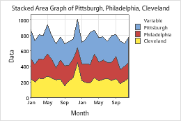
On an area graph, each shaded area represents the cumulative total for that variable and the variables below it. For example, the following area graph shows the monthly sales of a major retail chain at three stores over two years. Sales for all three groups in January was about 1000.

For information about data considerations, examples, and interpretation, go to Overview for Area Graph.
Continuous variables
Enter one or more columns of time-ordered numeric data that you want to graph.
Time scale labels (optional)
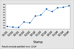
Label the x-axis with values from a column that contain date/time, numeric, or text values for the scale. For example, on the following time series plot, the column specifies the shift and day.
| C1-T |
|---|
| Shift and Day |
| S1D1 |
| S2D1 |
| S3D1 |
| ... |

By variables
- Show all combinations
-
When you enter multiple By variables, Minitab enables the Show all combinations checkbox. Select this option to create a separate plot for each combination of groups created by the By variables. If you do not select this option, Minitab creates a plot for each group of each By variable.
For example, the first By variable has 2 groups, Male and Female, and the second By variable has 2 groups, Employed and Unemployed. If you select Show all combinations, Minitab creates 4 separate plots for the combinations of Male/Employed, Male/Unemployed, Female/Employed, and Female/Unemployed. If you do not select Show all combinations, Minitab creates 4 separate plots for Male, Female, Employed, and Unemployed.
Stacking order
You can change the order in which variables are stacked when you create the graph.
- Order of entry (first on top)
- Stack the variables in the order in which you enter them in the dialog box. The first variable you enter is on the top, the second variable is under the first, and so on.
- Degree of variation (largest on top)
- Stack the variables by the degree of variation. The variable with the largest variation is on the top, the variable with the second largest variation is under the first, and so on.
Log transformation: Y-scale
Select to transform the Y-scale using logarithm base 10. A logarithmic scale linearizes logarithmic relationships by changing the axis, so that the same distance represents different changes in value across the scale. These options are available only for positive data.
