In This Topic
Step 1: Look for a model relationship and assess its strength
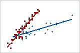
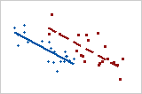
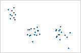
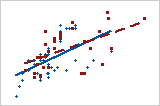
Determine which model relationship best fits your data and assess the strength of the relationship. If a model fits well, you can use the regression equation for that model to describe your data.
Tip
To see how well a particular model fits your data, add a fitted regression line. Double-click the graph. With the graph in editing mode, right-click the graph, then choose . You can hold the pointer over the fitted regression line to see the regression equation.
Type of relationship
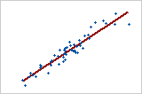
Linear: positive
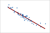
Linear: negative
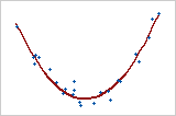
Curved: quadratic
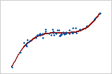
Curved: cubic
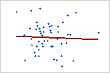
No relationship
If your data seem to fit a model, you can explore the relationship using a regression analysis.
Strength of relationship
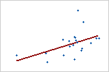
Weaker relationship
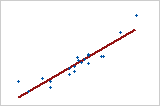
Stronger relationship
To quantify the strength of a linear (straight) relationship, use a correlation analysis.
Step 3: Look for other patterns
Outliers may indicate unusual conditions in your data. Time-based trends may indicate changing data conditions.
Outliers
Outliers, which are data values that are far away from other data values, can strongly affect your results.
On a scatterplot, isolated points identify outliers.
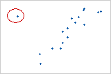
Try to identify the cause of any outliers. Correct any data entry or measurement errors. Consider removing data values that are associated with abnormal, one-time events (special causes). Then, repeat the analysis.
Time-based trends
If the X variable contains a sequence of time or date values recorded in order, look for time-based trends. To add connect a line to your scatterplot, double-click the graph. With the scatterplot in editing mode, right-click the graph, then choose and select Connect Line.
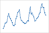
Cycling trend
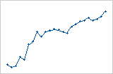
Increasing trend
Note
If you collected data in equally-spaced time intervals, you can use a time series plot.
