For information about data considerations, examples, and interpretation, go to Overview for Time Series Plot.
Continuous variables
Enter one or more columns of time-ordered numeric data that you want to graph.
Time scale labels (optional)
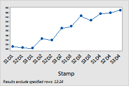
Label the x-axis with values from a column that contain date/time, numeric, or text values for the scale. For example, on the following time series plot, the column specifies the shift and day.
| C1-T |
|---|
| Shift and Day |
| S1D1 |
| S2D1 |
| S3D1 |
| ... |
Layout
Set the following layout options.
- Panel continuous variables
- Columns in the Continuous variables input field appear on a single time series plot where all variables share a single X-axis and each continuous variable appears in its own panel.
- Overlay continuous variables
- Columns in the Continuous variables input field are overlaid on a single time series plot.
By variables
- Show all combinations
-
When you enter multiple By variables, Minitab enables the Show all combinations checkbox. Select this option to create a separate plot for each combination of groups created by the By variables. If you do not select this option, Minitab creates a plot for each group of each By variable.
For example, the first By variable has 2 groups, Male and Female, and the second By variable has 2 groups, Employed and Unemployed. If you select Show all combinations, Minitab creates 4 separate plots for the combinations of Male/Employed, Male/Unemployed, Female/Employed, and Female/Unemployed. If you do not select Show all combinations, Minitab creates 4 separate plots for Male, Female, Employed, and Unemployed.
Y-scale
Select how you want to display the y-scale.
- Original data
- Select to use a single y-scale that is repeated for each variable. The minimum and maximum values for the scale are the overall minimum and maximum values from all the data that you entered.
- Percent of range
- Select to plot each variable with a unique y-scale. A series that contains all of the minimum or maximum values for each variable will be a horizontal line.
- Log scale
- A logarithmic scale linearizes logarithmic relationships by changing the axis, so that the same distance represents different changes in value across the scale. This option is available only for positive data.
Same Y-scale
Make the Y-scale the same across multiple panels.