A company that sells online book downloads collects a large amount of data to understand the
target audience and to increase online book sales. An analyst wants to create a
spline chart to examine the trends over the last few days of the number of downloads
of each genre of book. The data are in the wrong format for a spline chart, so the
analyst must create a saved view of the table with the Prep tool ![]() .
.
Note
This example explains how to prepare data so you can create a spline chart. You can use the same steps for many other charts, including area charts, line charts, waterfall charts, and more.
-
Open the Prep tool
 .
This example uses the Purchase Date
and Genre columns in this data set in
the Minitab Data Set Library, Online downloads data. For more
information on how to import data, go to Common tasks using the Base tool and select Import data
to a new table from an Excel file.
.
This example uses the Purchase Date
and Genre columns in this data set in
the Minitab Data Set Library, Online downloads data. For more
information on how to import data, go to Common tasks using the Base tool and select Import data
to a new table from an Excel file.
-
On the Fields tab, select Add a Field and select Purchase Date to add a
second instance of the Purchase Date
field.
Note
If you just imported your data, you may need to select Reset Config
 to display the
table.
to display the
table. - Rename the second instance of Purchase Date to Online Downloads.
-
Select the View button
 next to the Online Downloads
field to add the data prep and select Count.
next to the Online Downloads
field to add the data prep and select Count.
-
Select Run
 , and then select Save
 .
.
- Under View, select New View. Under Name, enter Online Downloads. Then select Save.
-
Open the Visualize tool
 .
From the Current Config dropdown list, select Online
Downloads.
.
From the Current Config dropdown list, select Online
Downloads.
- From Type, select Spline. Under Metric(s), select Online Downloads.
- Under Dimension(s), select Purchase Date.
- Under Breakdown(s), select Add Breakdown. In Fields select Genre.
-
Select Run
.
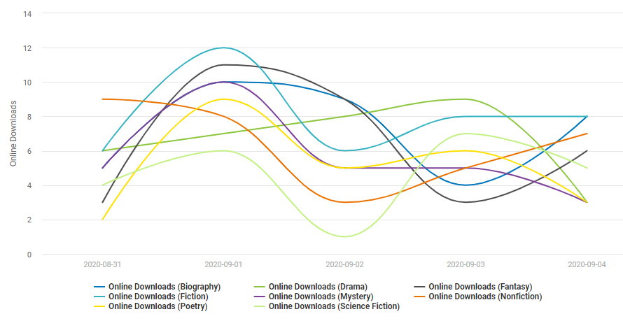
Interpret the results
The category Drama stands out the most, as it increases each day before decreasing the final day. Nonfiction is also the only category to decrease from September 31st to October 1st.