In the previous section, the analyst created a graph that shows the number of acceptances of the first email offer. Minitab Connect has many options to add variables and customize graphs. The analyst decides to add more variables and customize scale options.
Add more variables to your chart
In this example, the analyst wants to add data from the second and third email offers and the social media offers.
-
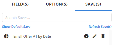
Open the Email Offer #1 by Date graph that you created previously in Create a new graph.
-
From the Visualize tool
 , open the Save(s) tab.
-
Select Run
 to open the
chart.
to open the
chart.
-
From the Visualize tool
- On the Field(s) tab, select Add Metric.
- Under Metric(s), select Accept Second Email Offer.
- Select Add Metric.
- Under Metric(s), select Accept Third Email Offer.
-
Select Run
to generate your
chart.
-
Select Save(s)
 to save this
visual.
to save this
visual.
- Under Visual, select New Visual and enter a Name. For this example, enter All Email Offers by Date.
- Select Save.
Example of all email offers
We now have two saved visuals with our data table.
This graph shows the number of acceptances for all email offers, by date. When you hover over the lines, you can see the data labels that identify the individual data points. This data label shows that 8 offers were accepted from the second email attempt on September 3.
Example of all email and social media offers
Repeat the steps from above to add the data from the social media offers. Add Accept First SM Offer, Accept Second SM Offer, and Accept Third SM Offer.
This graph shows the number of acceptances for all email and social media offers, by date.
You can add or remove individual variables by selecting the variables in the legend. You can also hover over a particular variable in the legend to bring it into focus.
Use the same scale to compare variables
From the previous section, the analyst created a graph that shows the number of acceptances for all email and social media offers. Notice that each field has a unique scale. However, in most cases, it is easier to compare variables when the scales are the same. Follow these instructions to use the same scale.
-
From the Visualize tool , open the
Fields tab.
- Select the
 button next to the Accept First Email Offer field to access more options for this field.
 - Under Axis Label, enter Acceptances.
- Select the button again to close the options for this field.
-
Select the button next
to the Accept Second Email Offer and under Axis Label, enter Acceptances.
- Repeat these steps to update all the axis labels to Acceptances.
-
Select Run
to generate your
chart.
-
Select Save
to save this
visual.
- Under Visual, select New Visual and enter a Name. For this example, enter All Offers on Same Scale.
- Select Save.
This graph shows the number of acceptances for all email and social media offers, by date, using the same scale for easy comparison.
Add a breakdown to your graph
In the previous section, the analyst created a graph that shows the number of acceptances for all email and social media offers with the same scale. Let's add a breakdown to see this data grouped by genre type.
-
From the Visualize tool , open the
Fields tab.
- On the Fields tab, select Add Breakdown.
- Under Breakdown(s), select Genre.
-
Select Run
to generate your
chart.
This graph shows the number of acceptances for all email and social media offers, by date and by genre, using the same scale for easy comparison.
With Minitab Connect, you can create graphs that contain a great deal of information. Next, we will explore different graph options.