In this example, the marketing analyst wants to investigate the effectiveness of email and social media campaigns. The team collects data for when a customer accepts an email or social media offer after the first, second, or third offer attempt.
Minitab Connect provides many types of graphs to show relationships between variables. Choose the graph that is best for your situation.
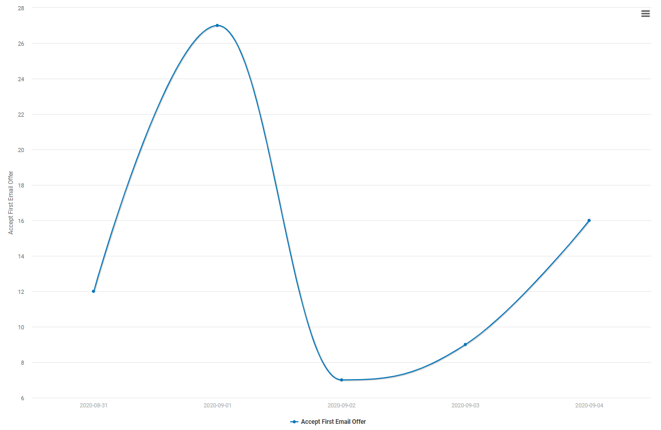
For this example, the analyst wants to create a chart of the number of offer acceptances from the first email offer by date. The analyst chooses a spline chart. A spline chart is a type of line chart that draws a curved line between points in a data series. With the spline chart, the analyst can determine patterns in the data.
- Open the Online Downloads table that you created previously in Create a custom view of your data.
-
Open the Visualize tool
 .
.
-
In the first drop down box, select Current Config.
If you want to use a specific view for the data source, choose that view
instead.
Note
The current configuration selection represents the data that is active in the Prep tool
 . Select Reset Config
 in the Prep tool to see all the data in the table.
 - Under Type, select Spline.
- Under Metric(s), specify the fields to display on the y-axis of the chart. For this example, select Accept First Email Offer.
- Under Dimension(s), specify the fields to display on the x-axis. For this example, select Purchase Date.
-
Select Run
 to generate your
chart.
-
Select Save
 to save this visual.
- Under Visual, select New Visual and enter a Name. For this example, enter Email Offer #1 by Date.
- Select Save.
Example of email offer #1
Here is our first saved visuals with our data table.

This graph shows the number of acceptances of the first email offer, by date.
