Note
You must select a data view before you can create an asset. Use the
Data panel ![]() to select a data view.
to select a data view.
In This Topic
Graph Builder
Use the Graph Builder to visualize your data and explore graph alternatives. Based on your input, the Graph Builder displays a preview of available graph candidates. As you explore the graph gallery, you can choose a graph candidate, then set options for the selected graph to see the effects of your changes in real-time.
Main areas
- 1: Column selector panel
- A list of the columns in the active worksheet.
- 2: Source data panel
- The available input fields and any display options associated with the selected graph.
- 3: Candidates list
- The complete list of all available graphs.
- 4: Canvas
- The area where Minitab displays the graph previews.
Tips
- To enter variables with the mouse, click the variable in the column selector panel and drag it to an input field in the source data panel.
- To enter variables with the keyboard, click in or tab to the input field and type the column name or column number of the variable to enter, such as C1 or Flaws.
- To rearrange the order of the variables on the graph, click a variable in an input field and drag it to a new location in the same field or to a different field within the source data panel.
- To delete variables from the
source data panel, click the
 in the variable name
or select the variable and press the Delete key.
in the variable name
or select the variable and press the Delete key.
Histogram
Use Histogram to examine the shape and spread of your data. A histogram works best when the sample size is at least 20.
Continuous variables
Enter one or more numeric columns that you want to graph.
Group variable
Enter a variable that defines the groups. Group labels are shown in the graph legend.
Y-scale
- Frequency
- The height of each bar represents the number of observations that fall within the bin of a histogram.
- Percent
- The height of each bar represents the percentage of the sample observations that fall within the bin. A histogram with a percentage scale is sometimes called a relative frequency histogram. Use a percent scale to compare samples of different sizes.
Probability Plot
Use Probability Plot to evaluate the fit of a distribution to the data, to estimate percentiles, and to compare sample distributions. A probability plot displays each value versus the percentage of values in the sample that are less than or equal to it, along a fitted distribution line. The y-axis is transformed so that the fitted distribution forms a straight line.
Continuous variables
Enter one or more numeric columns that you want to graph.
Group variable
Enter a variable that defines the groups. Group labels are shown in the graph legend.
Distribution
Boxplot
Use Boxplot to assess and compare the shape, central tendency, and variability of sample distributions and to look for outliers. A boxplot works best when the sample size is at least 20.
Continuous variables
Enter one or more numeric columns that you want to graph.
Categorical variables (optional)
Enter up to five columns of categorical data that define the groups. The first variable is the outermost on the scale and the last variable is the innermost.
Whiskers and outliers
- Jitter outliers
- If you have identical data values on your graph, outlier symbols could hide behind each other. Choose this option to move symbols slightly to reveal overlapping points.
Custom percentiles
With large datasets, where outliers are common, you can display custom percentiles instead of outliers to gather more information about the data. Custom percentiles occur outside of the interquartile box and typically occur in the tails of the distribution. In addition, lines are placed at the minimum and maximum values. By default, these percentile values are 0.5, 2.5, 10, 90, 97.5, and 99.5, but you can add, delete, or change them.
Y-scale
- Original units
- Use the original units of measure for numeric variables.
- Standardized units
- Convert different units of measure to a standard unit to make numeric variables comparable.
Variable display order
Minitab uses the terms "innermost" and "outermost" to indicate the relative position of the scales for multiple levels of groups displayed on a graph. For a horizontal scale, outermost refers to the scale at the bottom of the graph, and innermost refers to the scale farthest from the bottom, closest to the horizontal axis. For a vertical scale, outermost refers to the scale to the far left, and innermost refers to the scale closest to the vertical axis.
- Categorical variables first, Y's below
- Graph variables are the outermost groups and the categorical variables are the innermost groups.
- Y's first, categorical variables below
- Graph variables are the innermost groups and the categorical variables are the outermost groups.
Interval Plot
Use Interval Plot to assess and compare confidence intervals of the means of groups. An interval plot shows a 95% confidence interval for the mean of each group. An interval plot works best when the sample size is at least 10 for each group. Usually, the larger the sample size, the smaller and more precise the confidence interval.
Continuous variables
Enter one or more numeric columns that you want to graph.
Categorical variables (optional)
Enter up to five columns of categorical data that define the groups. The first variable is the outermost on the scale and the last variable is the innermost.
Confidence interval
Specify the settings for the confidence interval.
- Confidence level
- Enter the level of confidence for the confidence interval. Usually, a confidence level of 95% works well. A 95% confidence level indicates that, if you take 100 random samples from the population, the confidence intervals for approximately 95 of the samples will contain the population parameter.
- Use Bonferroni method
- Method for controlling the simultaneous confidence level for an entire set of confidence intervals. It is important to consider the simultaneous confidence level when you examine multiple confidence intervals because your chances that at least one of the confidence intervals does not contain the population parameter is greater for a set of intervals than for any single interval. To counter this higher error rate, the Bonferroni method adjusts the confidence level for each individual interval so that the resulting simultaneous confidence level is equal to the value you specify.
- Two-sided
- Use a two-sided confidence interval to estimate both likely lower and upper values for the mean.
- Upper one-sided
- Use a lower confidence bound to estimate a likely lower value for the mean.
- Lower one-sided
- Use an upper confidence bound to estimate a likely higher value for the mean.
- Use pooled standard deviation
- Select when you can assume all populations have equal variances.
Y-scale
- Original units
- Use the original units of measure for numeric variables.
- Standardized units
- Convert different units of measure to a standard unit to make numeric variables comparable.
Variable display order
Minitab uses the terms "innermost" and "outermost" to indicate the relative position of the scales for multiple levels of groups displayed on a graph. For a horizontal scale, outermost refers to the scale at the bottom of the graph, and innermost refers to the scale farthest from the bottom, closest to the horizontal axis. For a vertical scale, outermost refers to the scale to the far left, and innermost refers to the scale closest to the vertical axis.
Choose one of the following options when you have multiple Y variables with groups.
- Categorical variables first, Y's below
- Graph variables are the outermost groups and the categorical variables are the innermost groups.
- Y's first, categorical variables below
- Graph variables are the innermost groups and the categorical variables are the outermost groups.
Individual Value Plot
Use Individual Value Plot to assess and compare sample data distributions. An individual value plot shows a dot for the actual value of each observation in a group, making it easy to spot outliers and see distribution spread.
Continuous variables
Enter one or more numeric columns that you want to graph.
Categorical variables (optional)
Enter up to five columns of categorical data that define the groups.
Jitter individual symbols
If you have identical data values on your graph, individual symbols could hide behind each other. Choose this option to move symbols slightly to reveal overlapping points.
Y-scale
- Original units
- Use the original units of measure for numeric variables.
- Standardized units
- Convert different units of measure to a standard unit to make numeric variables comparable.
Variable display order
Minitab uses the terms "innermost" and "outermost" to indicate the relative position of the scales for multiple levels of groups displayed on a graph. For a horizontal scale, outermost refers to the scale at the bottom of the graph, and innermost refers to the scale farthest from the bottom, closest to the horizontal axis. For a vertical scale, outermost refers to the scale to the far left, and innermost refers to the scale closest to the vertical axis.
- Categorical variables first, Y's below
- Graph variables are the outermost groups and the categorical variables are the innermost groups.
- Y's first, categorical variables below
- Graph variables are the innermost groups and the categorical variables are the outermost groups.
Variability Chart
Use Variability Chart as a preliminary tool to investigate variation in your data, including cyclical variations and interactions between factors. The variability charts show the relationships between factors and responses. Each chart displays up to eight factors. For information about data considerations, examples, and interpretation, go to Overview for Variability Chart.
Response variable
Enter a numeric column that contain the measurement data.
Factors
Enter the columns that contain the levels for the factors. The first variable is the outermost on the scale and the last variable is the innermost. You can have up to 8 factors.
Data Representation
- Individual data points
- Plot individual data points on the average response with variation chart.
- Range per cell
- Display every range bar that connects the minimum and maximum data points for each combination of factor levels.
- Connecting lines of cell means
- Add a line that connects the means for the factor level combinations.
- Overall mean
- Display a horizontal line at the overall mean on the average response with variation chart.
- Means for factor
- Display a horizontal line at the means for the factor on the average response with variation chart.
Scale
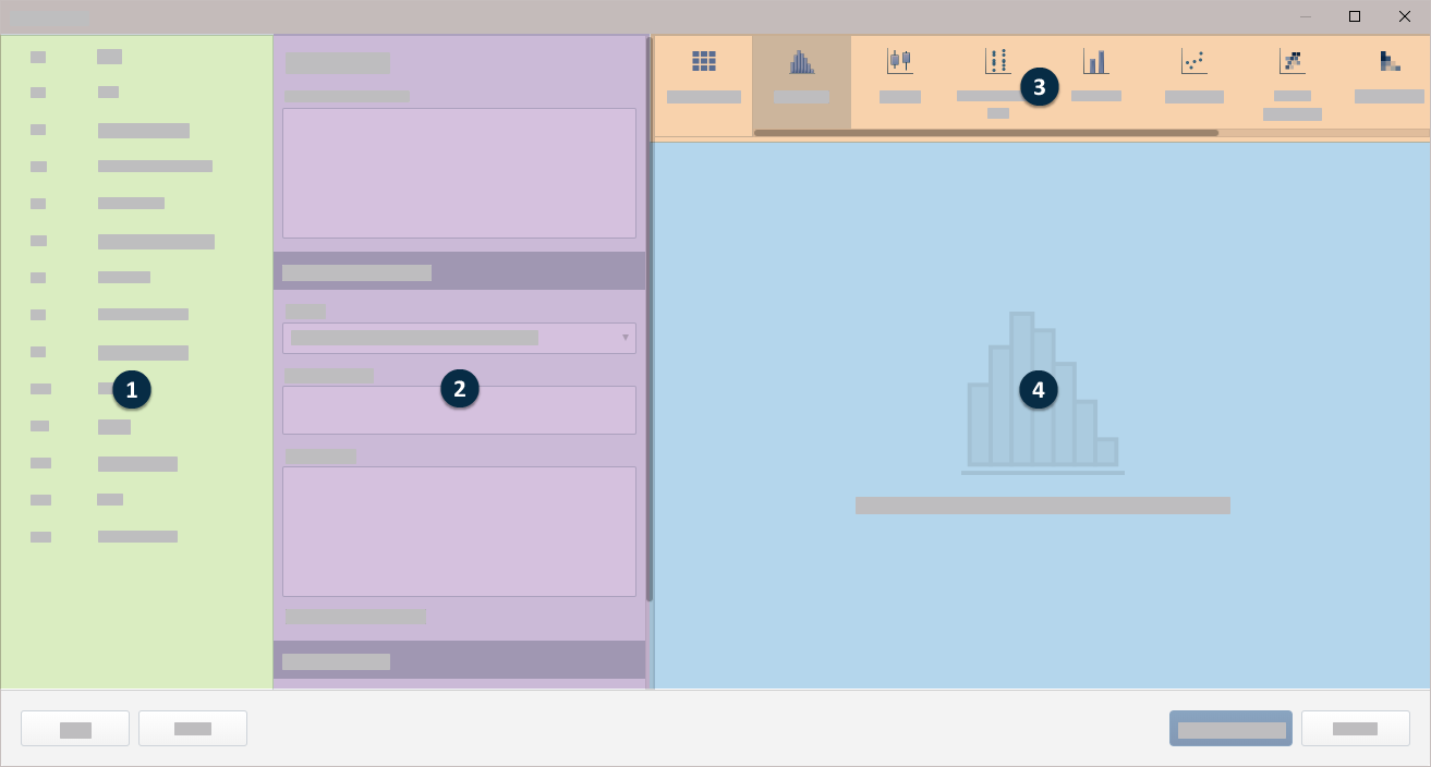
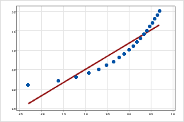
- Log transformation: Y-scale
-
A logarithmic scale linearizes logarithmic relationships by changing the axis, so that the same distance represents different changes in value across the scale. For example, in the scatterplot with the untransformed Y-scale, the function is not linear. When you transform the Y-scale to logarithm base e, the form of the data is linear.
Untransformed Y-scale
Transformed Y-scale (log base 10 transformation)
Line Plot
Use Line Plot to compare response patterns of a function or a series. You can create a line plot with symbols or without symbols, depending on the number of groups and length of series that you want to compare.
Summarized variable
Enter a column that defines the points in the line chart.
From Function, select the function of the Summarized variable. For example, if you select Maximum, Minitab defines the color for the graph based on the maximum value of the summarized variables. If you enter a text column in Summarized variable, you can only select Percent equal to specified values, Number of nonmissing values, or Number of missing values.
- Percentile
- If you select Percentile, you must enter a value in Percentile value. The value must be between 0 and 100. Minitab uses the value you enter to define the color gradient in the graph. For example, if you enter 50, Minitab uses the 50th percentile to define the color gradient for each point on the graph.
- Percent between two values
- If you select Percent between two values, you must enter numeric values in First value and Second value. The value you enter for First value must be less than or equal to the value you enter for Second value. Minitab defines the color gradient for the graph based on the percentage of observations that is between the two values.
- Percent equal to specified values
- If you select Percent equal to specified values, you must enter one or more values in Values. The values must be the same type of data as the column you entered in Summarized variable. Minitab defines the color gradient for the graph based on the percentage of observations that is equal to the values that you enter.
Categorical variable
Enter a categorical variable that defines the x axis.
Legend groups
When you enter multiple Summarized variable, multiple summarized variables are overlaid on the same graph. Select Categories form legend groups to have the groups of the Continuous variables form the legend and the columns you specify in Summarized variable form the x-axis. Select Summarized variables form legend groups to have the columns you specify in Summarized variable form the legend and the groups of the Continuous variables form the x-axis.
Group variable
Enter a variable that defines the groups. Group labels are shown in the graph legend.
Display symbols
Select to display a symbol at each point on the x-axis. If you do not select this option, the graph displays only the lines.
Display function as percent of total
Select this option to change the Y-scale type to percent.
Pareto Chart
Use Pareto Chart to identify the most frequent defects, the most common causes of defects, or the most frequent causes of customer complaints. Pareto charts can help to focus improvement efforts on areas where the largest gains can be made.
Defects or attribute data
Enter the column that contains the raw data or the summary data. If you have a single column of raw data, enter that column. If you have summary data, enter the column that contains the names of the defects.
If you use text data, be sure that the defect names are distinct within the first 15 characters.
Summarized variable (optional)
Enter a numeric column that contains the counts of the summary data.
Combine the remaining defects after this cumulative percent
Minitab generates bars for defect categories until the cumulative percentage surpasses the percentage that you specify. Then, Minitab groups the remaining defects into a category labeled "Other".
Display percent scale and cumulative line
Select this option to display the cumulative percent symbols, the connecting line, and the percent scale.
Bar Chart
Use Bar Chart to compare the counts, means, or other summary statistics using bars to represent groups or categories. The height of the bar shows either the count or variable function for the group.
Categorical variables
Enter one or more numeric columns that you want to graph.
Summarized variables (optional)
Enter a numeric or text column that defines the bars in the bar chart.
Function
From Function, select the function of the Summarized variables. For example, if you select Maximum, Minitab defines the color for the bar chart based on the maximum value of the summarized variables in each bar. If you enter a text column in Summarized variables, you can only select Percent equal to specified values, Number of nonmissing values, or Number of missing values.
- Percentile
- If you select Percentile, you must enter a value in Percentile value. The value must be between 0 and 100. Minitab uses the value you enter to define the color gradient in the bar chart. For example, if you enter 50, Minitab uses the 50th percentile to define the color gradient for each rectangle of the bar chart.
- Percent between two values
- If you select Percent between two values, you must enter numeric values in First value and Second value. The value you enter for First value must be less than or equal to the value you enter for Second value. Minitab defines the color gradient for the bar chart based on the percentage of observations that is between the two values.
- Percent equal to specified values
- If you select Percent equal to specified values, you must enter one or more values in Values. The values must be the same type of data as the column you entered in Summarized variables. Minitab defines the color gradient for the bar chart based on the percentage of observations that is equal to the values that you enter.
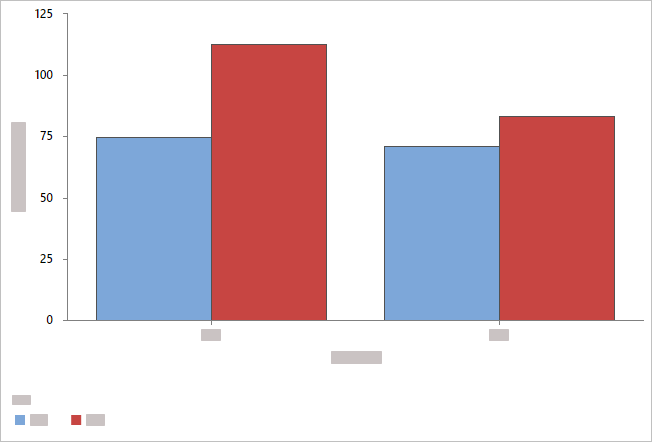
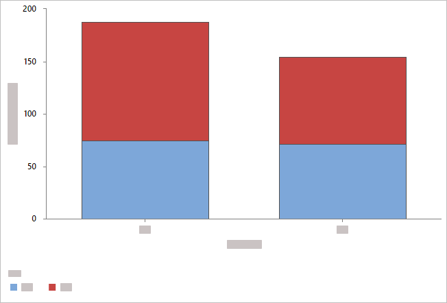
Overlay
When you select multiple categorical variables and you choose to overlay the graphs, you can choose how to display the overlaid bars.
- Overlaid with evenly spaced bars
- By default, Minitab displays the bars evenly along the axis. Categorical groups are displayed
at different levels along the axis in the order in which they appear in
Categorical variables.
- Overlaid with clustered bars
- Minitab displays categorical groups as clustered bars and includes a legend. You can change
the grouping by reordering the variables in Categorical variables, or you can choose a different variable from Cluster variable.
- Overlaid with stacked bars
- Minitab displays the categorical groups as stacked bars and includes a legend. You can change
the levels at which the categories appear by reordering the variables in
Categorical variables, or you can choose a different variable from Cluster variable.
Note
When you have more than one summarized variable and you choose to
overlay the graphs, you have the option to cluster or stack the bars by the
summarized variables.
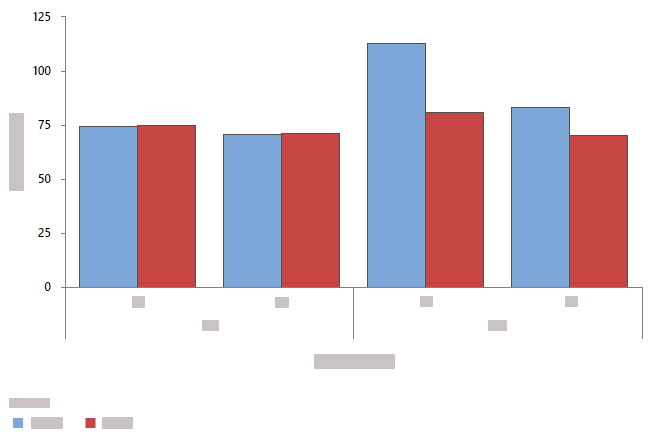
Clustered by summarized variables
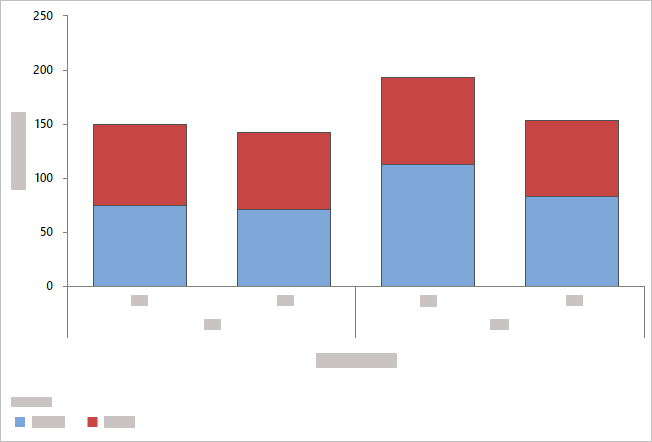
Stacked by summarized variables
Order bars by
- Default
- By default, when you graph counts of unique values or a function of a variable, Minitab arranges the bars in increasing order by category name (for example: Group 1, Group 2, Group 3).
- Increasing Y
- Arranges bars in increasing order based on Y values.
- Decreasing Y
- Arranges bars in decreasing order based on Y values.
Display counts as percent of total
When you do not enter Summarized variables, select this option to change the Y-scale type from count to percent.
Display function as percent of total
When you enter Summarized variables, select this option to change the Y-scale type to percent.
Same Y-scale
Make the Y-scale the same across multiple graphs.
Variable display order
Minitab uses the terms "innermost" and "outermost" to indicate the relative position of the scales for multiple levels of groups displayed on a graph. For a horizontal scale, outermost refers to the scale at the bottom of the graph, and innermost refers to the scale farthest from the bottom, closest to the horizontal axis. For a vertical scale, outermost refers to the scale to the far left, and innermost refers to the scale closest to the vertical axis.
- Categorical variables first, Y's below
- Graph variables are the outermost groups and the categorical variables are the innermost groups.
- Y's first, categorical variables below
- Graph variables are the innermost groups and the categorical variables are the outermost groups.
Pie Chart
Use Pie Chart to compare the proportion of data in each category or group. A pie chart is a circle ("pie") that is divided into segments ("slices") to represent the proportion of observations that are in each category.
Categorical variables
Enter one or more columns of categorical data that you want to graph.
Summarized variables (optional)
Enter one or more columns of summary values that you want to graph.
Display Type
- Pie
-
- Donut

- Semicircle

Order slices by
- Default
- If you enter only Categorical variables, Minitab displays the slices in alphabetical order. If you also enter Summarized variables, Minitab displays the slices in the same order the Categorical variables appear in the worksheet. You can change the default behavior by setting a value order for the Categorical variables. To change the order of values in a text column, go to Change the display order of text values in Minitab output.
- Increasing Area
- Order slices from smallest to largest.
- Decreasing Area
- Order slices from largest to smallest.
Combine slices of this percent or less
Enter a minimum percentage for separate slices. Categories less than this percentage are grouped into a slice named Other.
Scatterplot
Use Scatterplot to investigate the relationship between a pair of continuous variables. A scatterplot displays ordered pairs of X and Y variables in a coordinate plane.
Variables
You can graph the x and y-variables as individual pairs or you can graph every combination of the x-y variables. The y-variable is the variable that you want to explain or predict. The x-variable is a corresponding variable that might explain or predict changes in the y-variable. All columns must be numeric, and each x-y variable pair must have the same number of rows.
First, choose one of the following options.
- Each Y versus each X
- Select to display a separate graph for each possible combination of x and y-variables that you enter.
- XY Pairs
- Select to display a separate graph for each pair of x and y-variables that you enter. Each x-y variable pair must have the same number of rows.
Then, enter the variables.
- Y variables
- Select the variables that you want to explain or predict.
- X variables
- Select the variables that might explain or predict the changes in the Y variables.
Group variable
Enter a variable that defines the groups. Group labels are shown in the graph legend.
Log transformation
- Log transformation: Y-scale
- Select to transform the Y-scale using logarithm base 10.
- Log transformation: X-scale
- Select to transform the X-scale using logarithm base 10.
Binned Scatterplot
Use Binned Scatterplot to investigate the relationship between a pair of continuous variables when the dataset contains many observations.
Variables
The y-variable is the variable that you want to explain or predict. The x-variable is a corresponding variable that might explain or predict changes in the y-variable. All columns must be numeric, and each x-y variable pair must have the same number of rows.
- Y variables
- Select the variables that you want to explain or predict.
- X variables
- Select the variables that might explain or predict the changes in the Y variables.
Gradient defined by mean
Select to define the gradient scale by the value of a third variable.
Gradient Type
Select the color scale for the bins.
- Diverging
- Bins with high values are red, and bins with low values are blue. In Gradient symmetric around value, enter a value to center the gradient scale at a specific value rather than the center of the frequency of the binned data.
-

- Sequential from low to high
- Bins with high values are dark blue, and bins with low values are
light blue and light gray. You can use this option to highlight bins with more
productivity or to maximize revenue.

- Sequential from high to low
- Bins with low values are dark blue, and bins with high values are
light blue and light gray. You can use this option to highlight bins with low
defect rates or to minimize cost.

Log transformation
- Log transformation: Y-scale
- Select to transform the Y-scale using logarithm base 10.
- Log transformation: X-scale
- Select to transform the X-scale using logarithm base 10.
Bubble Plot
Use Bubble Plot to explore the relationship between two variables where the size of each symbol, or bubble, represents the size of a third variable.
Variables
The y-variable is the variable that you want to explain or predict. The x-variable is a corresponding variable that might explain or predict changes in the y-variable. All columns must be numeric, and each x-y variable pair must have the same number of rows.
- Y variables
- Select the variables that you want to explain or predict.
- X variables
- Select the variables that might explain or predict the changes in the Y variables.
Bubble Size
Enter a column that determines the size (area) of the bubbles.
Group variable
Enter a variable that defines the groups. Group labels are shown in the graph legend.
Log transformation
- Log transformation: Y-scale
- Select to transform the Y-scale using logarithm base 10.
- Log transformation: X-scale
- Select to transform the X-scale using logarithm base 10.
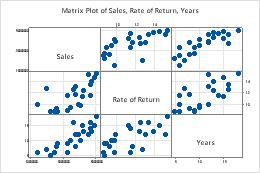
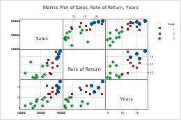
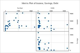
Matrix Plot
Use Matrix Plot to assess the relationships between several pairs of variables at once. A matrix plot is an array of scatterplots. You can select Matrix of plots that creates a single plot for every possible combination of variables. Or you can select Each Y versus each X to create a plot for each possible xy combination.
Matrix of plots
In Continuous variables, enter columns of numeric data with the same number of rows. Minitab displays a scatterplot for each combination of variables.
In this worksheet, Rate of Return, Sales, and Years are the graph variables. The graph shows the relationships between each possible combination of graph variables.
| C1 | C2 | C3 |
|---|---|---|
| Rate of Return | Sales | Years |
| 15.4 | 50400200 | 18 |
| 11.3 | 42100650 | 15 |
| 9.9 | 39440420 | 12 |
| ... | ... | ... |
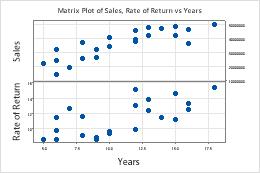
Each Y versus each X
In Y variables, enter columns of numeric data that you want to explain or predict. In X variables, enter columns of numeric data that might explain changes in the Y variables.
In this worksheet, Rate of Return and Sales are the Y variables and Years is the X variable. The graph shows the relationships between each Y variable and the X variable.
| C1 | C2 | C3 |
|---|---|---|
| Rate of Return | Sales | Years |
| 15.4 | 50400200 | 18 |
| 11.3 | 42100650 | 15 |
| 9.9 | 39440420 | 12 |
| ... | ... | ... |
Layout
Select Full matrix to display both the lower left portion of the matrix and the upper right portion. The two portions display the same data with the axes reversed. For example, variables that appear on the x-axis in the lower left portion of the matrix appear on the y-axis in the upper right portion.
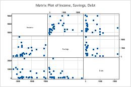
Full matrix
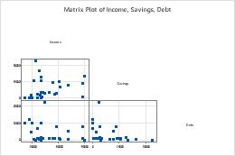
Lower left
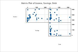
Upper right
Group variable
Enter a variable that defines the groups. Groups are represented by different colors and symbols. For example, the following matrix plot shows the relationships between each possible combination of the variables Rate of Return, Sales and Years, divided into three groups.
Variable label placement
Diagonal
Boundary
Scale
Use the same scale across multiple graphs.
- Same Y-scale
- Use the same Y-scale across all graphs.
- Same X-scale
- Use the same X-scale across all graphs.
Correlogram
Use Correlogram to visualize and compare the strength and direction of linear relationships (correlations) between pairs of variables.
Continuous variables
Enter the columns that contain the data. You must enter at least two columns of numeric data. Each column must have the same number of rows.
Gradient Type
Select the color scale for the bins.
- Automatic
- When you select Automatic, the gradient type depends on the calculation of the Pearson
correlation coefficients.
- If the coefficients are positive and negative, the Gradient Type is Diverging symmetric around 0.
- If the coefficients are all positive, the Gradient Type is Sequential from low to high.
- If the coefficients are all negative, the Gradient Type is Sequential from high to low.
- Diverging
- Bins with high values are red, and bins with low values are blue. In Gradient symmetric around value, enter a value to center the gradient scale at a specific value rather than the center of the frequency of the binned data.
-
- Sequential from low to high
- Bins with high values are dark blue, and bins with low values are
light blue and light gray. You can use this option to highlight bins with more
productivity or to maximize revenue.
- Sequential from high to low
- Bins with low values are dark blue, and bins with high values are
light blue and light gray. You can use this option to highlight bins with low
defect rates or to minimize cost.
Display correlation values
Select to display the value of the Pearson correlation coefficient within each rectangle of the graph.
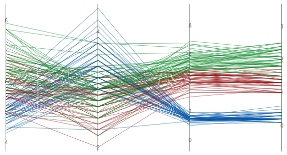
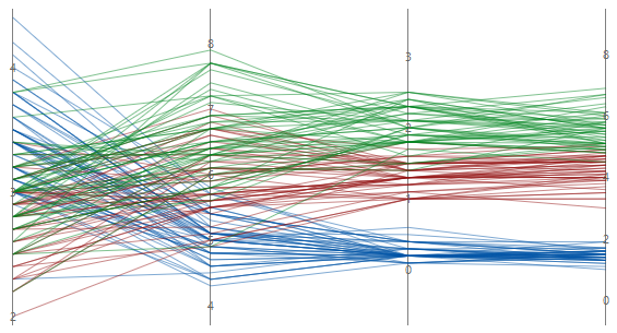
Parallel Coordinates Plot
Use Parallel Coordinates Plot to visually compare many series or groups of series on parallel coordinates across multiple variables.
Variables
Enter at least two columns of numeric data.
Row labels
Enter a column that contains labels for each series. Minitab uses this column to label a series on the plot when you hover over it with your cursor. If you don't enter a Group variable Minitab uses the label column to create a legend for the parallel plot.
Layout
Choose one of the following layout options.
- Individual series
- Creates a parallel plot that displays a series for every row in the worksheet. The worksheet must include at least two columns of numeric data.
- Individual series by group
- Creates a parallel plot that displays a series for every row in the worksheet and uses the same color for each level of the grouping variable. The worksheet must include at least two columns of numeric data and one column that contains the groups.
- Summarized groups
- Creates a parallel plot that displays the mean of each series for every group in the worksheet, not every row. The worksheet must include at least two columns of numeric data and one column that contains the groups.
Group variable
Enter a variable that defines the groups. Group labels are shown in the graph legend. You must enter a column when you select Individual series by group or Summarized groups.
Y-scale
Select how you want to display the y-scale.
- Percent of range
-
Select to plot each variable with a unique y-scale. A series that contains all of the minimum or maximum values for each variable will be a horizontal
line.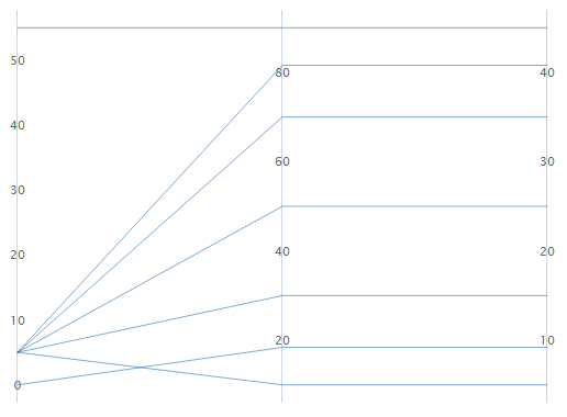
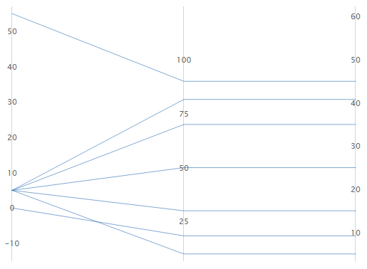
- Standard units
-
Select to plot each variable with a unique y-scale. The minimum and maximum values for each scale are the overall minimum and maximum z-score values from all the data that you entered converted to each variable's scale.
For example, the first variable's maximum value has a z-score of 2, while the other two variable's maximum value has a z-score of 1. The maximum value for each variable's y-scale is the value that corresponds to a z-score of 2.
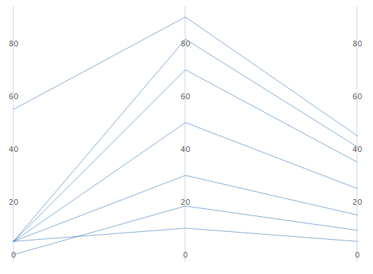
- Original data
-
Select to use a single y-scale that is repeated for each variable. The minimum and maximum values for the scale are the overall minimum and maximum values from all the data that you entered.
Sort variables from greatest to least variation in lines
If you select Standard units or Original data, you can sort the variables based on the variation. This can be useful when you have many variables and you want to see which one separates the series the most. If you do not select this option, Minitab sorts the columns in the same order as you enter them in the Variables dialog box.
Unsorted
Sorted
Heatmap
Use Heatmap to compare the means or other summary statistics using a color gradient to represent the impact of different groups.
Categorical row variables
Enter up to five columns where the categories are represented as rows on the heatmap.
Categorical column variables
Enter up to five columns where the categories are represented as columns on the heatmap.
Summarized variables (optional)
Enter a numeric or text column that defines the color gradient of the rectangles in the heatmap. If you enter multiple columns, Minitab generates a separate heatmap for each variable that you enter.
Function
From Function, select the function of the Summarized variables. For example, if you select Maximum, Minitab defines the color gradient for the heatmap based on the maximum value of the summarized variables in each rectangle. If you enter a text column in Summarized variables, you can only select Percent equal to specified values, Number of nonmissing values, or Number of missing values.
- Percentile
- If you select Percentile, you must enter a value in Percentile value. The value must be between 0 and 100. Minitab uses the value you enter to define the color gradient in the heatmap. For example, if you enter 50, Minitab uses the 50th percentile to define the color gradient for each rectangle of the heatmap.
- Percent between two values
- If you select Percent between two values, you must enter numeric values in First value and Second value. The value you enter for First value must be less than or equal to the value you enter for Second value. Minitab defines the color gradient for the heatmap based on the percentage of observations that is between the two values.
- Percent equal to specified values
- If you select Percent equal to specified values, you must enter one or more values in Values. The values must be the same type of data as the column you entered in Summarized variables. Minitab defines the color gradient for the heatmap based on the percentage of observations that is equal to the values that you enter.
Gradient Type
- Diverging
- Bins with high values are red, and bins with low values are blue. In Gradient symmetric around value, enter a value to center the gradient scale at a specific value rather than the center of the frequency of the binned data.
-
- Sequential from low to high
- Bins with high values are dark blue, and bins with low values are
light blue and light gray. You can use this option to highlight bins with more
productivity or to maximize revenue.
- Sequential from high to low
- Bins with low values are dark blue, and bins with high values are
light blue and light gray. You can use this option to highlight bins with low
defect rates or to minimize cost.
Wafer Plot
Use a Wafer Plot to compare the means or other summary statistics using a color gradient to represent changes in a response variable. For information about data considerations, examples, and interpretation, go to Overview for Wafer plot.
Y coordinates
Enter a numeric column with data that represents the y-axis on the wafer plot.
X coordinates
Enter a numeric column with data that represents the x-axis on the wafer plot.
Response variable
Enter a numeric column that defines the color gradient of the rectangles in the wafer plot. From Function, select the function of the Response variable. For example, if you select Maximum, Minitab defines the color gradient for the wafer plot based on the maximum value of the response variable in each rectangle.
- Percentile
- If you select Percentile, you must enter a value in Percentile value. The value must be between 0 and 100. Minitab uses the value you enter to define the color gradient in the wafer plot. For example, if you enter 50, Minitab uses the 50th percentile to define the color gradient for each rectangle of the wafer plot.
- Percent between two values
- If you select Percent between two values, you must enter numeric values in First value and Second value. The value you enter for First value must be less than or equal to the value you enter for Second value. Minitab defines the color gradient for the wafer plot based on the percentage of observations that is between the two values.
- Percent equal to specified values
- If you select Percent equal to specified values, you must enter one or more values in Values. The values must be the same type of data as the column you entered in Response variable. Minitab defines the color gradient for the wafer plot based on the percentage of observations that is equal to the values that you enter.
By variable
Enter a grouping variable in By variable to create a separate wafer plot for each level of the grouping variable. The column that you enter must be the same length as the columns in X coordinates and Y coordinates.
Gradient Type
- Diverging
- Rectangles with high values are red, and rectangles with low values are blue. In Gradient symmetric around value, enter a value to center the gradient scale at a specific value rather than the center of the function that you selected. For example, a business owner selects the gradient to be defined by the mean of the profit of multiple products across multiple stores. The owner enters 0 as the Gradient symmetric around value so that rectangles with products that made a profit are a different color than those that lost money.
-
- Sequential from low to high
- Rectangles with high values are dark blue, and rectangles with low
values are light blue and light gray. You can use this option to
highlight rectangles with more productivity or to maximize revenue.
- Sequential from high to low
- Rectangles with low values are dark blue, and rectangles with high
values are light blue and light gray. You can use this option to
highlight rectangles with low defect rates or to minimize cost.
- Different color gradients
- You can choose from 5 alternate color gradients.
Gradient Range
Note
If you specified Percent between two values or Percent equal to specified values for the function, the wafer plot uses a percentage scale for the gradient. In these cases, the value that you enter for Minimum and Maximum should be between 0 and 1.
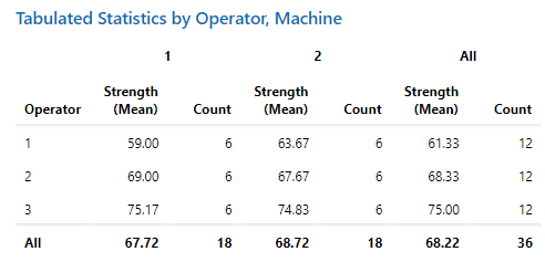
Tabulated Statistics
Use Tabulated Statistics when you have data that are categorized by one or more categorical variables. You can determine various statistics for combinations of categories across two or more categorical variables.
Variables
- In Categorical row variables, enter up to 3 columns that contain the categories that define the rows of the table.
- In Categorical column variables, enter up to 2 columns that contain the categories that define the columns of the table.
-
In Summarized variable (optional), enter the columns that contain the associated variables to summarize. An associated variable is a continuous variable that is grouped by categorical variables.
By default, the mean is the only statistic the table displays. To display additional statistics, select Summary Statistics from the dropdown that is beside the variable name. Some statistics require you to enter additional values.- Percentile
- In Percentile value, enter a value between 0 and 100. For example, if you enter 50, Minitab displays the 50th percentile.
- Percent between two values
- You must enter numeric values in First value and Second value. The First value must be less than or equal to the Second value. Minitab displays the percentage of observations that is equal to or between the two values. This includes observations equal to the two values.
- Percent equal to specified values
- In Values, enter one or more values that are the same type of data as the column you entered in Summarized variable. Minitab displays the percentage of observations that is equal to the values that you enter.
For more information on table layouts, go to Arrangement of output tables.
| C1 | C2 | C3 |
|---|---|---|
| Strength | Machine | Operator |
| 38 | 1 | 1 |
| 40 | 2 | 2 |
| 63 | 3 | 3 |
| 59 | 4 | 1 |
| 76 | 1 | 2 |
| ... | ... | ... |
Categorical Variable Summary Statistics
- Count
- Display the observed count for each combination of row and column variables.
- Row percent
- Display the percentage that each cell represents of the total observations in the table row.
- Column percent
- Display the percentage that each cell represents of the total observations in the table column.
- Total percent
- Display the percentage that each cell represents of all the observations in the table.
Display Options
- Display marginal statistics
- Select to display the marginal statistics. Marginal statistics provide information about the rows and columns of your table, such as the totals.
- Display missing values
- Select to display missing values. Minitab excludes all rows with any missing variables unless you include missing data. Select Include displayed missing values in calculations to include missing values in the calculations. For more information, go to How to interpret missing values in a table.
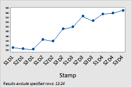
Time Series Plot
Use Time Series Plot to look for patterns in your data over time, such as trends or seasonal patterns.
Continuous variables
Enter one or more columns of time-ordered numeric data that you want to graph.
Time scale labels (optional)
Label the x-axis with values from a column that contain date/time, numeric, or text values for the scale. For example, on the following time series plot, the column specifies the shift and day.
| C1-T |
|---|
| Shift and Day |
| S1D1 |
| S2D1 |
| S3D1 |
| ... |
Layout
Set the following layout options.
- Panel continuous variables
- Columns in the Continuous variables input field appear on a single time series plot where all variables share a single X-axis and each continuous variable appears in its own panel.
- Overlay continuous variables
- Columns in the Continuous variables input field are overlaid on a single time series plot.
Y-scale
Select how you want to display the y-scale.
- Original data
- Select to use a single y-scale that is repeated for each variable. The minimum and maximum values for the scale are the overall minimum and maximum values from all the data that you entered.
- Percent of range
- Select to plot each variable with a unique y-scale. A series that contains all of the minimum or maximum values for each variable will be a horizontal line.
- Log scale
- A logarithmic scale linearizes logarithmic relationships by changing the axis, so that the same distance represents different changes in value across the scale. This option is available only for positive data.
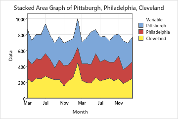
Stacked Area Graph
Use Stacked Area Graph to plot the cumulative sum of groups in time order and evaluate how each group contributes to the whole. On an area graph, each shaded area represents the cumulative total for that variable and the variables below it. For example, the following area graph shows the monthly sales of a major retail chain at three stores over two years. Sales for all three groups in January was about 1000.
Continuous variables
Enter one or more columns of time-ordered numeric data that you want to graph.
Time scale labels (optional)
Label the x-axis with values from a column that contain date/time, numeric, or text values for the scale. For example, on the following time series plot, the column specifies the shift and day.
| C1-T |
|---|
| Shift and Day |
| S1D1 |
| S2D1 |
| S3D1 |
| ... |
Stacking order
You can change the order in which variables are stacked when you create the graph.
- Order of entry (first on top)
- Stack the variables in the order in which you enter them in the dialog box. The first variable you enter is on the top, the second variable is under the first, and so on.
- Degree of variation (largest on top)
- Stack the variables by the degree of variation. The variable with the largest variation is on the top, the variable with the second largest variation is under the first, and so on.
Log transformation: Y-scale
Select to transform the Y-scale using logarithm base 10. A logarithmic scale linearizes logarithmic relationships by changing the axis, so that the same distance represents different changes in value across the scale. These options are available only for positive data.
KPI
- Select a Data Source that contains your data.
- In Variable, specify the KPI measure.
- Select a Function, such as mean, sum, or maximum.
- You can optionally change the Title.
You can also customize other options to change how the KPI appears on the dashboard. Toggle the Auto button off to specify your own formatting for the variable.
Value Formatting
- Custom Decimal Places
- Specify the number of decimal places for the variable. The maximum number of decimal places is 12.
- Size and Layout
- Specify the size and alignment of the variable.
- Title position
- Specify to display the title either above or below the variable.
- Text Color
- Specify the color and opacity of the variable. The opacity can be any number between 0 and 100. Lower numbers result in the variable being more transparent.
Conditional Formatting
- Select the Conditional Formatting tab.
- Select Add.
- Specify the condition in Operator. For example, you want to apply the formatting when the KPI value is Greater Than a certain value.
- Enter a numeric Value.
- In Conditional Text (optional), enter text to display beside the Title when the variable meets the condition.
- In Conditional Text Color, specify the color and opacity of the variable when it meets the condition. The opacity can be any number between 0 and 100. Lower numbers result in the variable being more transparent.
You can add multiple conditions. If the KPI variable meets multiple conditions,
the dashboard applies the condition lowest on the list. You can select the
ellipses ![]() to move a condition up or down in the list.
to move a condition up or down in the list.
Table
Note
If you add a filter control to the dashboard, the filter does not affect table assets. Use the Prep tool to filter your data and save a new data view. For more information, go to Common tasks using the Prep tool and select "Filter your data".