A team of researchers collects and publishes detailed information about factors that affect heart disease. Variables include age, sex, cholesterol levels, maximum heart rate, and more. This example is based on a public data set that gives detailed information about heart disease. The original data are from archive.ics.uci.edu.
The researchers want to create a classification tree that identifies important predictors to indicate whether a patient has heart disease.
- Open the sample data, HeartDiseaseBinary.MWX.
- Choose .
- From the drop-down list, select Binary response.
- In Response, enter Heart Disease.
- In Response event, select Yes to indicate that heart disease has been identified in the patient.
- In Continuous predictors, enter Age, Rest Blood Pressure, Cholesterol, Max Heart Rate, and Old Peak.
- In Categorical predictors, enter Sex, Chest Pain Type, Fasting Blood Sugar, Rest ECG, Exercise Angina, Slope, Major Vessels, and Thal.
- Click OK.
Interpret the results
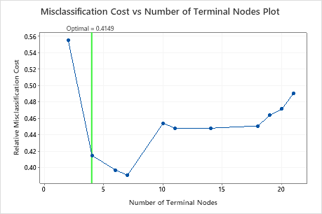
By default, Minitab displays the smallest tree with a misclassification cost within 1 standard error of the tree that minimizes the misclassification cost. This tree has 4 terminal nodes.
Select an alternative tree
- In the output, click Select Alternative Tree
- In the plot, select the 7-node tree that has the least misclassification cost and the best ROC value.
- Click Create Tree.
Interpret the results
In the tree diagram, items that are blue are for the event level. Items that are red are for the nonevent level. In this output, the event level is "Yes" and indicates that someone has heart disease. The nonevent level is "No" and indicates that someone does not have heart disease.
- Node 2: There are 167 cases when THAL was Normal. Of the 167 cases, 38 or 22.8% are Yes and 129 or 77.2% are No.
- Node 5: There are 136 cases when THAL was Fixed or Reversible. Of the 136 cases, 101 or 74.3% are Yes and 35 or 25.7% are No.
The next splitter for both the left child node and the right child node is Chest Pain Type, where pain is rated as 1, 2, 3, or 4.
Explore other nodes to see which variables are most interesting. The nodes that are mostly blue indicate a strong proportion of the event level. The nodes that are mostly red indicate a strong proportion of the nonevent level.
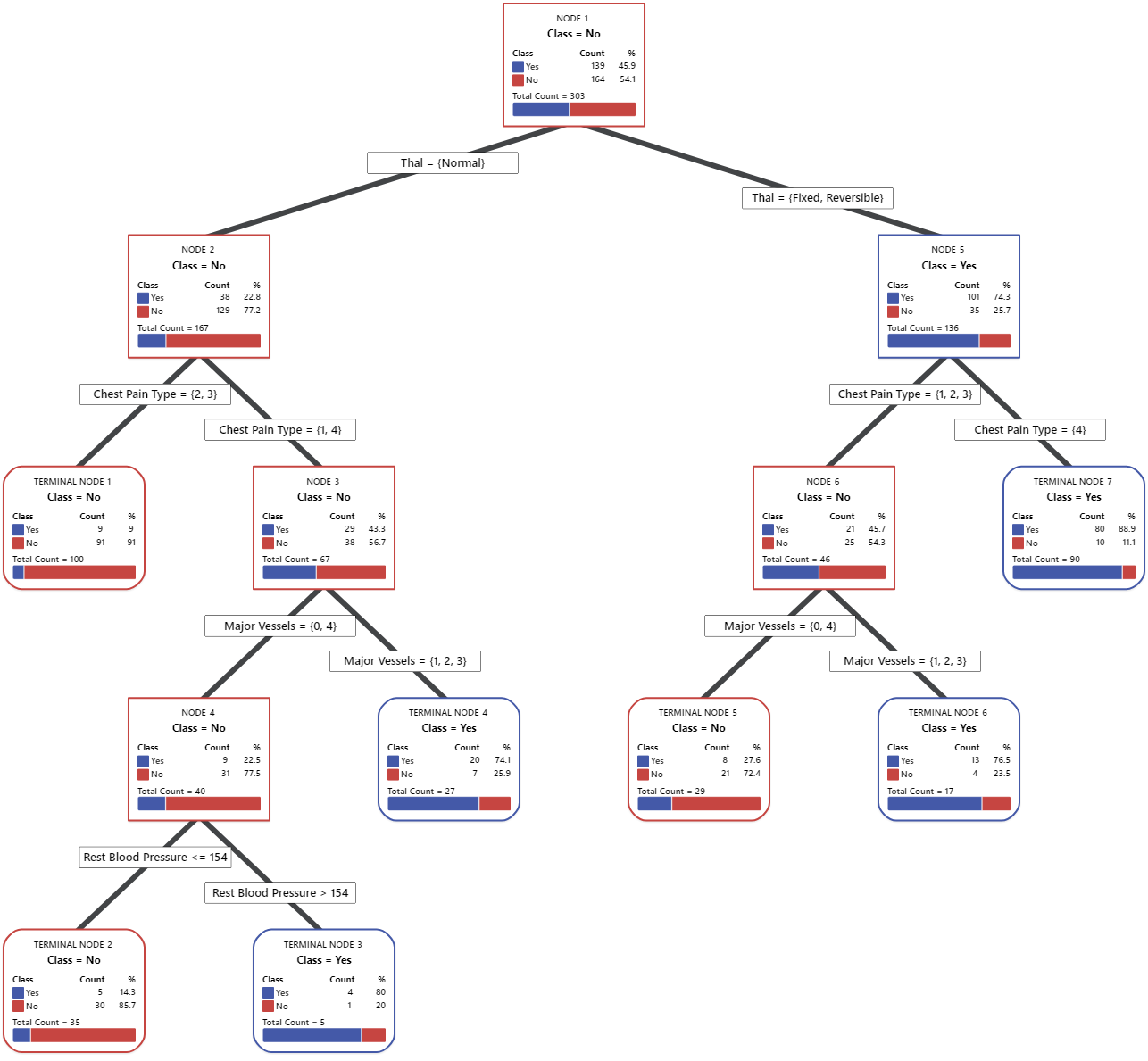
The tree diagram uses the entire data set or the training data set. You can toggle views of the tree between the detailed view and the node split view.
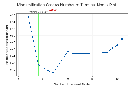
This tree has a misclassification cost of about 0.391.
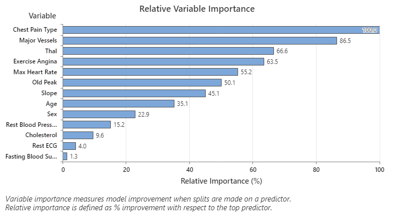
The most important predictor variable is Chest Pain Type. If the contribution of the top predictor variable, Chest Pain Type, is 100%, then the next important variable, Major Vessels, has a contribution of 86.5%. This means Major Vessels is 86.5% as important as Chest Pain Type in this classification tree.
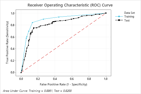
The area under the ROC curve for the test data is 0.8200, which indicates reasonable classification performance, in many applications. For applications that require greater prediction accuracy, you can try to improve the performance with a TreeNet® Classification model or a Random Forests® Classification model.
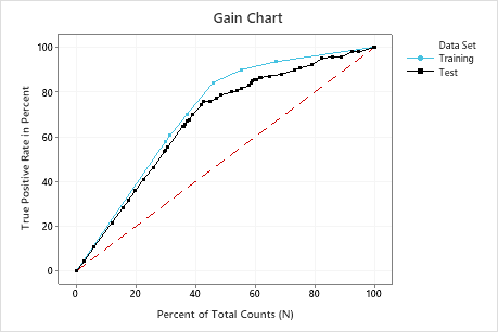
In this example, the gain chart shows a sharp increase above the reference line, then a flattening. In this case, approximately 40% of the data account for approximately 70% of the true positives.
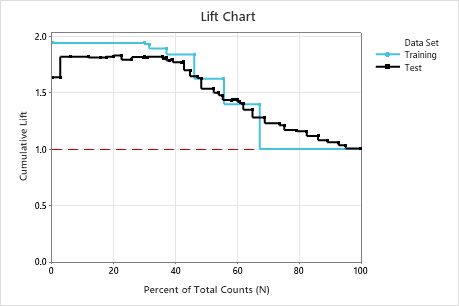
In this example, the lift chart shows an increase above the reference line that gradually drops off.
Method
| Prior probabilities | Same for all classes |
|---|---|
| Node splitting | Gini |
| Optimal tree | Minimum misclassification cost |
| Model validation | 10-fold cross-validation |
| Rows used | 303 |
Binary Response Information
| Variable | Class | Count | % |
|---|---|---|---|
| Heart Disease | Yes (Event) | 139 | 45.87 |
| No | 164 | 54.13 | |
| All | 303 | 100.00 |
Model Summary
| Total predictors | 13 |
|---|---|
| Important predictors | 13 |
| Number of terminal nodes | 7 |
| Minimum terminal node size | 5 |
| Statistics | Training | Test |
|---|---|---|
| Average -loglikelihood | 0.3971 | 0.5094 |
| Area under ROC curve | 0.8861 | 0.8200 |
| 95% CI | (0.5590, 1) | (0.7702, 0.8697) |
| Lift | 1.9376 | 1.8165 |
| Misclassification cost | 0.2924 | 0.3909 |
Confusion Matrix
| Predicted Class (Training) | |||||||
|---|---|---|---|---|---|---|---|
| Predicted Class (Test) | |||||||
| Actual Class | Count | Yes | No | % Correct | Yes | No | % Correct |
| Yes (Event) | 139 | 117 | 22 | 84.2 | 105 | 34 | 75.5 |
| No | 164 | 22 | 142 | 86.6 | 24 | 140 | 85.4 |
| All | 303 | 139 | 164 | 85.5 | 129 | 174 | 80.9 |
| Statistics | Training (%) | Test (%) |
|---|---|---|
| True positive rate (sensitivity or power) | 84.2 | 75.5 |
| False positive rate (type I error) | 13.4 | 14.6 |
| False negative rate (type II error) | 15.8 | 24.5 |
| True negative rate (specificity) | 86.6 | 85.4 |
Misclassification
| Input Misclassification Cost | Predicted Class | |
|---|---|---|
| Actual Class | Yes | No |
| Yes | 1.00 | |
| No | 1.00 | |
| Training | Test | ||||||
|---|---|---|---|---|---|---|---|
| Actual Class | Count | Misclassed | % Error | Cost | Misclassed | % Error | Cost |
| Yes (Event) | 139 | 22 | 15.8 | 0.1583 | 34 | 24.5 | 0.2446 |
| No | 164 | 22 | 13.4 | 0.1341 | 24 | 14.6 | 0.1463 |
| All | 303 | 44 | 14.5 | 0.1462 | 58 | 19.1 | 0.1955 |