In This Topic
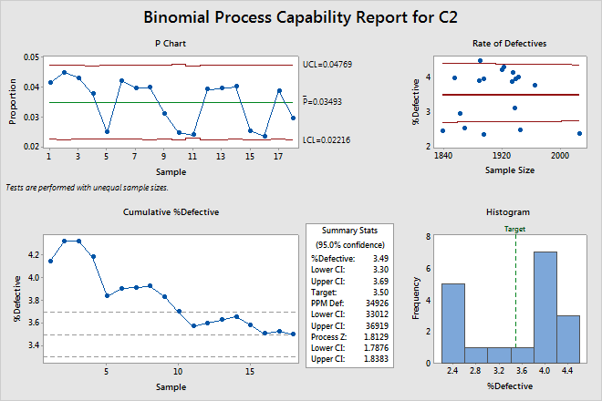
P chart
The P chart plots the proportion of nonconforming units (also called defectives) for each subgroup. The center line is the average proportion of defectives across all subgroups. The control limits, which are set at a distance of 3 standard deviations above and below the center line, show the amount of variation that is expected in the subgroup proportions.
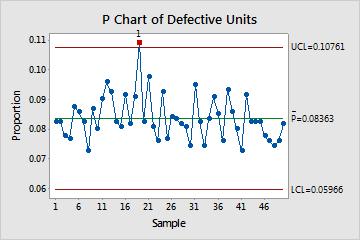
This P chart shows that, on average, 8% of items are defective on any given day. The proportion of defective units for day 19 is out of control because its value does not fall within the limits of the expected variation.
Interpretation
Use the P chart to visually monitor the %defective and to determine whether the %defective is stable and in control.
Red points indicate subgroups that fail at least one of the tests for special causes and are not in control. Out-of-control points indicate that the process may not be stable and that the results of a capability analysis may not be reliable. You should identify the cause of out-of-control points and eliminate special-cause variation before you analyze process capability.
Tests for special causes
The tests for special causes assess whether the plotted points on each control chart are randomly distributed within the control limits.
Interpretation
Use the tests for special causes to determine which observations you may need to investigate and to identify specific patterns and trends in your data. Each of the tests for special causes detects a specific pattern or trend in your data, which reveals a different aspect of process instability.
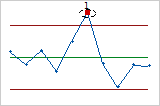
- One point more than 3 sigmas from center line
- Test 1 identifies subgroups that are unusual compared to other subgroups. Test 1 is
universally recognized as necessary for detecting out-of-control
situations. If small shifts in the process are of interest, you can use
Test 2 to supplement Test 1 in order to create a control chart that has
greater sensitivity.
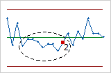
- Nine points in a row on same side of center line
- Test 2 identifies shifts in the process variation. If small shifts in the process are of
interest, you can use Test 2 to supplement Test 1 in order to create a
control chart that has greater sensitivity.
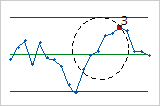
- Six points in a row, all increasing or all decreasing
- Test 3 detects trends. This test looks for long series of consecutive points that
consistently increase in value or decrease in value.
- Fourteen points in a row, alternating up and down
- Test 4 detects systematic variation. You want the pattern of variation in a process to be
random, but a point that fails Test 4 might indicate that the pattern of
variation is predictable.
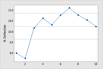
Cumulative %Defective plot
The points on the Cumulative %Defective plot show the mean %defective for each sample. The points are displayed in the order that the samples were collected. The middle horizontal line represents the mean %defective calculated from all the samples. The upper and lower horizontal lines represent the upper and lower confidence bounds for the mean %defective.
Interpretation
Use the Cumulative %Defective plot to determine whether you have enough samples for a stable estimate of the %defective.
Examine the %defective for the time-ordered samples to see how the estimate changes as you collect more samples. Ideally, the %defective stabilizes after several samples, as shown by a flattening of the plotted points along the mean %defective line.
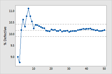
Enough samples
In this plot, the %defective stabilizes along the mean %defective line. Therefore, the capability study includes enough samples for a stable, reliable estimate of the mean %defective.
Not enough samples
In this plot, the %defective does not stabilize. Therefore, the capability study does not include enough samples to reliably estimate the mean %defective.
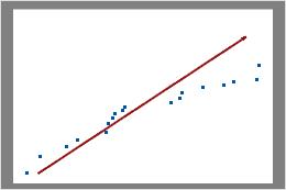
Binomial plot
The binomial plot displays the observed number of defective items versus the expected number of defective items. The diagonal line shows where the data would fall if they perfectly followed the binomial distribution. If the data stray significantly from this line, binomial capability analysis may not provide reliable results.
Note
Minitab displays a binomial plot when the subgroup sizes are equal. If the subgroup sizes vary, Minitab displays a rate of defectives plot. For more information, go to the section on the Rate of Defectives plot.
Interpretation
Use the binomial plot to assess whether your data follow a binomial distribution.
Examine the plot to determine whether the plotted points approximately follow a straight line. If not, then the assumption that the data were sampled from a binomial distribution may be false.
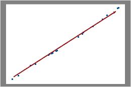
In this plot, the data points fall closely along the line. You can assume that the data follow a binomial distribution.
In this plot, the data points do not fall along the line near the top right part of the plot. These data do not follow a binomial distribution and cannot be reliably evaluated using binomial capability analysis.
Important
If the points do not fall along the line, the binomial distribution may not be appropriate for your data, and your capability analysis may not be valid.
Rate of Defectives plot
The Rate of Defectives plot displays the percentage of defective items in a subgroup (%defective) and the size of each subgroup. The center line equals the mean probability that an item is defective. The confidence bounds for the mean are displayed above and below the center line.
Note
Minitab displays a rate of defectives plot when the subgroup sizes vary. If the subgroup sizes are constant, Minitab displays a binomial plot. For more information, go to the section on the Binomial plot.
Interpretation
Use the Rate of Defectives plot to verify that your data is binomial by checking the assumption that the probability of a defective item is constant across different sample sizes.
Examine the plot to assess whether the %defective is randomly distributed across sample sizes or whether a pattern is present. If your data fall randomly about the center line, you conclude that the data follow a binomial distribution.
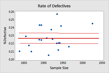
Binomial
In this plot, the points are scattered randomly around the center line. You can assume that the data follow a binomial distribution.
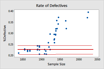
Not binomial
In this plot, the pattern is not random. For sample sizes that are greater than 1900, the %defective rate increases as the sample size increases. This result suggests a correlation between sample size and percentage of defectives. Therefore, the data do not follow a binomial distribution and cannot be reliably evaluated using binomial capability analysis.
Histogram
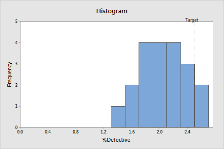
Interpretation
Use the %defective histogram to assess the distribution of the %defective in your samples.
Examine the peak and spread of the %defective distribution. The peak represents the most common values and approximates the center of the %defectives. Assess the spread to understand how much the %defective varies across your samples.
Compare the reference line for the target value with the bars of the histogram. If your process is capable, most or all of the bars of the histogram should be to the left of the target value.
%Defective
The percentage defective (%defective) is the average percentage of items in your samples that are unacceptable. The other items can be classified as "passing" or "good".
Interpretation
Use %defective to determine whether your process is meeting customer requirements.
Compare the target %defective with the %defective to assess whether the process meets requirements. If the %defective is higher than the target, you should improve your process.
You should also compare the target to the upper CI for %defective. If the upper CI is greater than the target, you cannot be confident that the %defective for your process is less than the target. You may need a larger sample size to determine with more confidence whether your process is on target.
For example, suppose the %defective for a customer service process should not exceed 3.5%. In the Summary Stats table, the %defective is 3.49%, which is less than the target. However, the upper CI for %defective is 3.69%, which is greater than the target. Although sample estimate of %defective is below the target, you need a larger sample size to determine with more confidence whether the %defective for the process meets customer requirements.
Target
The target %defective is the maximum %defective that you are willing to accept. If you did not specify a target, Minitab assumes a target of 0% defective.
Interpretation
Compare the target %defective with the %defective to assess whether the process meets requirements. If the %defective is higher than the target, you should improve your process.
You should also compare the target to the upper CI for %defective. If the upper CI is greater than the target, you cannot be confident that the %defective for your process is less than the target. You may need a larger sample size to determine with more confidence whether your process is on target.
For example, in the Summary Stats table, the %defective is 3.46%, which is less than the target (3.50%). However, the upper CI for %defective is 3.66%, which is greater than the target. Although the process appears to meet requirements, you need a larger sample size to determine with more confidence whether the %defective is below the target.
PPM Def
Parts per million defective (PPM Def) estimates the number of units out of a million that you can expect to be defective. If you collect a sample of 1,000,000 items from the current process, PPM Def is the approximate number of defectives that will be in the sample.
Interpretation
Compare PPM Def with your customer requirements to determine whether your process needs improvement.
You should also consider the upper CI for PPM Def. If the upper CI is greater than the maximum allowable value, you cannot be confident that your process meets customer requirements. You may need a larger sample size to determine with more confidence whether your process meets customer requirements.
For example, in the Summary Stats table, the PPM Def is 34,926. If the customer requires that PPM Def be less than 35,000, the process meets requirements. However, the upper CI is 36,919, which is greater than the customer requirement. Therefore, you need a larger sample size to determine with more confidence whether the process is acceptable.
Process Z
Process Z is the point on a standard normal distribution N (0, 1), such that the area to the right of that point is equal to the Average P (the proportion of defective units in your process).
A process Z of 0 corresponds to 50% defective.
A process Z of 2 corresponds to 2.275% defective.
Interpretation
Use the process Z to evaluate the sigma capability of a binary process.
Larger Z values indicate that the process is performing better. Ideally, you want a process Z of at least 2. The target value for your process depends on the consequences of a defective for your customer.
Confidence interval (CI)
The confidence interval is a range of likely values for a capability index. The confidence interval is defined by a lower bound and an upper bound. The bounds are calculated by determining a margin of error for the sample estimate. The lower confidence bound defines a value that the capability index is likely to be greater than. The upper confidence bound defines a value that the capability index is likely to be less than.
Minitab displays both a lower confidence bound and an upper confidence bound for %Defective, PPM Def, and Process Z.
Interpretation
Because samples of data are random, different samples collected from your process are unlikely to yield identical estimates of a capability index. To calculate the actual value of the capability index for your process, you would need to analyze data for all the items that the process produces, which is not feasible. Instead, you can use a confidence interval to determine a range of likely values for the capability index.
At a 95% confidence level, you can be 95% confident that the actual value of the capability index is contained within the confidence interval. That is, if you collect 100 random samples from your process, you can expect approximately 95 of the samples to produce intervals that contain the actual value of the capability index.
The confidence interval helps you to assess the practical significance of your sample estimate. When possible, compare the confidence bounds with a benchmark value that is based on process knowledge or industry standards.
For example, the maximum allowable defective rate for a manufacturing process is 0.50% defective. Using binomial capability analysis, analysts obtain a %defective estimate of 0.31%, which suggests that the process is capable. The upper CI for %defective is 0.48%. Therefore, the analysts can be 95% confident that the actual value of the %defective does not exceed the maximum allowable value, even when considering the variability from random sampling that affects the estimate.