Youden plots are used to analyze inter-laboratory data and compare both the within-laboratory variability and the between-laboratory variability.
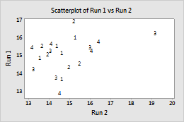
Example of a Youden plot
Suppose that at each of several laboratories, a measurement is obtained for each of two products. The measurements for the first product are in C1, the measurements for the second product are in C2, and the laboratory identifier numbers are in C3. You want to create a Youden plot to compare the within-laboratory variability and the between-laboratory variability.
- Choose .
- Choose Simple, then click OK
- Under Y variables, enter C1. Under X variables, enter C2.
- Click Labels, then click the Data Labels tab.
- Under Label Type, choose Use labels from column and enter C3.
- Click OK in each dialog box.
- Right-click the graph, then choose Edit Graph.
- Double-click a data point.
- Under Symbols, choose Custom.
- Under Type, choose None. Click OK.
- Double-click a data label.
- Click the Alignment tab.
- Under Position, choose Custom, and choose Centered. Click OK.