Complete the following steps to specify the data for your graph.
- In Y variables, enter up to 20 columns of numeric or date/time data that you want to explain or predict.
- In X variables, enter up to 20 columns of numeric or date/time data that might explain changes in the Y variables.
Minitab displays a scatterplot for each combination of Y and X variables.
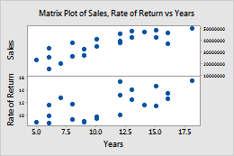
In this worksheet, Rate of Return and Sales are the Y variables and Years is the X variable. The graph shows the relationships between each Y variable and the X variable.
| C1 | C2 | C3 |
|---|---|---|
| Rate of Return | Sales | Years |
| 15.4 | 50400200 | 18 |
| 11.3 | 42100650 | 15 |
| 9.9 | 39440420 | 12 |
| ... | ... | ... |