A quality engineer at a textile manufacturer wants to determine the factors that affect the breaking strength of a synthetic fiber. The engineer samples the output of four production machines and three operators selected at random.
The engineer creates a line plot with symbols to compare the mean strength of fibers for the groups and look for possible interactions.
- Open the sample data, FiberStrength.MWX.
- Choose .
- In Function, select Mean.
- In Graph variables, enter Strength.
- In Categorical variable for X-scale grouping, enter Operator.
- In Categorical variable for legend grouping, enter Machine.
- Click OK.
Interpret the results
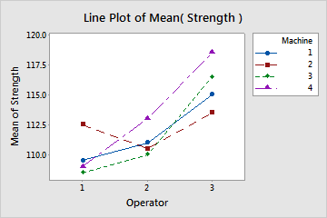
The non-zero slope of all lines suggests differences in the mean fiber strength between operators. Operator 1 generally produced the lowest mean strength regardless of the machine used, while operator 3 produced the highest mean strength. The effect of machine is not consistent. Any given machine produces a high or low mean strength depending on the operator. The non-parallel line associated with operator 1 on machine 2 suggests a possible interaction. This combination produced an unexpectedly high mean strength that may warrant a follow-up investigation.