For information about data considerations, examples, and interpretation, go to Overview for Matrix Plot.
Variables
You can select Matrix of Plots that creates a single plot for every possible combination of variables. Or you can select Each Y versus each X to create a plot for each possible xy combination.
Matrix of plots
In Continuous variables, enter columns of numeric data with the same number of rows. Minitab displays a scatterplot for each combination of variables.
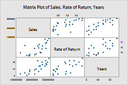
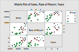
In this worksheet, Rate of Return, Sales and Years are the graph variables. The graph shows the relationships between each possible combination of graph variables.
| C1 | C2 | C3 |
|---|---|---|
| Rate of Return | Sales | Years |
| 15.4 | 50400200 | 18 |
| 11.3 | 42100650 | 15 |
| 9.9 | 39440420 | 12 |
| ... | ... | ... |
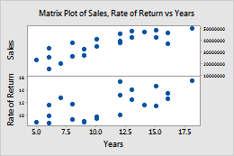
Each Y versus each X
In Y variables, enter columns of numeric data that you want to explain or predict. In X variables, enter columns of numeric data that might explain changes in the Y variables.
In this worksheet, Rate of Return and Sales are the Y variables and Years is the X variable. The graph shows the relationships between each Y variable and the X variable.
| C1 | C2 | C3 |
|---|---|---|
| Rate of Return | Sales | Years |
| 15.4 | 50400200 | 18 |
| 11.3 | 42100650 | 15 |
| 9.9 | 39440420 | 12 |
| ... | ... | ... |
Layout
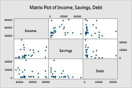
By default, when you create a matrix of plots, Minitab displays both the lower left portion of the matrix and the upper right portion. The two portions display the same data with the axes reversed. For example, variables that appear on the x-axis in the lower left portion of the matrix appear on the y-axis in the upper right portion.
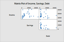
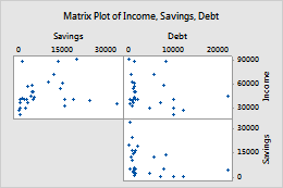
Full matrix
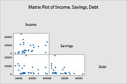
Lower left
Upper right
Group variable
Enter a variable that defines the groups. Groups are represented by different colors and symbols. For example, the following matrix plot shows the relationships between each possible combination of the variables Rate of Return, Sales and Years, divided into three groups.
Variable label placement
Diagonal
Boundary
Scale
Use the same scale across multiple graphs.
- Same Y-scale
- Use the same Y-scale across all graphs.
- Same X-scale
- Use the same X-scale across all graphs.