Choose data display elements
To add or remove symbols or connect lines after you create the graph, use the following steps:
- Double-click the graph.
- Right-click the graph and choose .
To apply the existing group attributes to a new element, select Apply same groups of current displays to added displays when you add the element.
Note
For information on adding or changing the grouping variables for an existing graph, go to Display groups on graphs.
For example, the following line plot displays both symbols and connect lines.
Note
For more information on editing these graph features, go to the following topics.
Change y to a percent scale
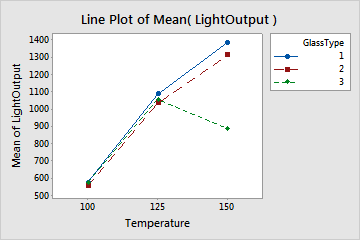
By default, the scale on the y-axis is in data units. For example, the y-axis values in the following line plot represent light output.
| C1 | C2 | C3 |
|---|---|---|
| LightOutput | Temperature | GlassType |
| 580 | 100 | 1 |
| 1090 | 125 | 1 |
| 1392 | 150 | 1 |
| 550 | 100 | 2 |
| ... | ... | ... |
You can change the y-axis to a percentage scale. When you create a plot, click Plot Options. On an existing plot, use the following steps:
- Double-click the graph.
- Right-click the graph and choose .
- Select Show Y as Percent, and choose one of the following options.
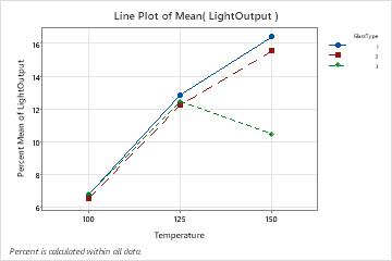
- Across all x-categories
- The sum of all plotted values is 100%. For example, in this plot, the sum of all nine plotted values is 100%.
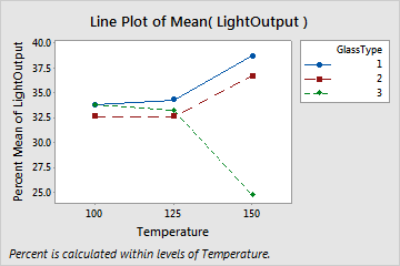
- Within each x-category
- The sum of the plotted values within each x-category is 100%. Use this option if you want to standardize within categories and accentuate differences. For example, in this plot, the sum of the three plotted values at each level of Temperature is 100%.