In This Topic
Step 1: Assess the variation between parts
Use a gage run chart to assess the variation in the measured values for each measured part. The gage run chart helps you see how much measurement variability is due to operators or parts.
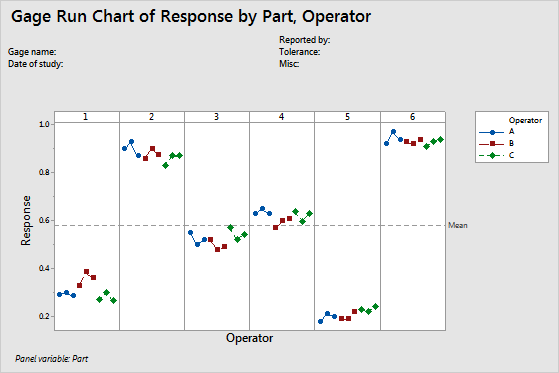
The part‐to‐part variation is quite noticeable in this chart—Part 2 and Part 6 have higher measurements than Part 1 and Part 5.
Step 2: Assess the variation between measurements from each operator
For each part, you can compare both the variation between measurements made by each operator, and differences in measurements between operators. You can also look at the measurements in relationship to the horizontal reference line. By default the reference line is the mean of all observations.
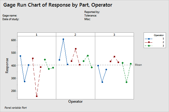
This gage run chart shows that the operator's measurements do not have good repeatability. Each operator measures each part 3 times (3 trials). When the same operator measures the same part, the differences between the measurements are large. Oscillations could indicate that the operators adjust how they measure between measurements.
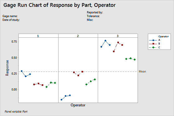
This gage run chart shows that the operators measure more consistently for each part, but the differences in the measurements between operators for the same part are large.