What is an attributes control chart?
Minitab offers several attribute control charts that plot defects or defectives. A defect refers to a quality characteristic and a defective unit refers to the overall product. A unit may have many defects, but the unit itself is either defective or nondefective. For example, a scratch on a metal panel is a defect. If several scratches exist, the entire panel may be considered defective.
Select your attribute control chart based on whether your data follow a binomial or a Poisson distribution.
Attributes control charts for binomial data
Values for binomial data are classified into one of two categories such as pass/fail or go/no-go. Binomial data are often used to calculate a proportion or a percentage, such as the percentage of sampled parts that are defective.
- P charts show the proportion of defective units on the y-axis.
- NP charts show the whole number of defective units on the y-axis.
Attributes control charts with varying subgroup sizes
- The control limits for both charts vary.
- The center line on the NP chart varies, but the center line on the P chart is straight.
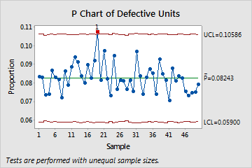
With a P chart, the center line is straight.
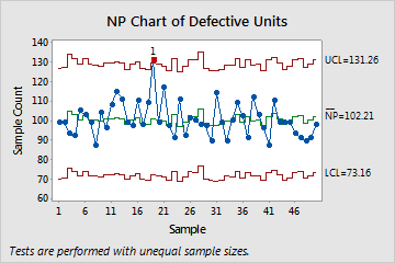
With an NP chart, the center line varies with subgroup size changes.
Attributes control charts for Poisson data
Values for Poisson data are often counts of defects or events. Poisson data are often used to model an occurrence rate, such as defects per unit.
- U charts show the number of defects per unit on the y-axis.
- C charts show the number of defects per sample, where each item can have multiple defects.
Note
Minitab does not create C charts for data with different numbers of units per subgroup.