Interpretation
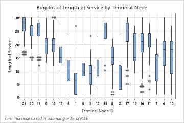
By default, the nodes are in order from least error to greatest error. When you run the analysis, you can find an option to sort the nodes by identification number by pressing the Graphs button.
When the analysis uses a test data set, the graph includes separate boxplots for the training and test data. The performance of the tree on the test data is a typically a better representation of how the tree performs for new data. You should investigate large differences between the test and training data.
In the following chart, 3 of the highest medians are for terminal nodes 17, 16, and 14, which also have the smallest errors. Terminal node 1 has the smallest median. Terminal nodes 1 and 3 have one outlier apiece, while other terminal nodes with outliers have more than 1. The error for terminal node 8 is greatest.