In This Topic
Step 1: Identify the best level for each control factor
Use the signal-to-noise ratio (S/N ratio) to identify the control factor settings that minimize the variability caused by the noise factors. Minitab calculates the S/N ratio for each combination of control factors and then calculates the average S/N ratio for each level of each control factor. Choose from four S/N ratios, based on the experimental goal and an understanding of the desired outcome of the process. For more information, go to What is the signal-to-noise ratio in a Taguchi design?.
Delta is the difference between the highest and lowest average response values for each factor. Minitab assigns ranks based on Delta values; Rank 1 to the highest Delta value, Rank 2 to the second highest, and so on, to indicate the relative effect of each factor on the response.
Response Table for Signal to Noise Ratios
| Level | Variety | Light | Fertilizer | Water | Spraying |
|---|---|---|---|---|---|
| 1 | -1.9266 | -0.6911 | -4.1399 | -0.9870 | 0.2274 |
| 2 | 2.8068 | 1.5712 | 5.0201 | 1.8672 | 0.6527 |
| Delta | 4.7333 | 2.2623 | 9.1600 | 2.8542 | 0.4253 |
| Rank | 2 | 4 | 1 | 3 | 5 |
Response Table for Slopes
| Level | Variety | Light | Fertilizer | Water | Spraying |
|---|---|---|---|---|---|
| 1 | 0.6867 | 0.6043 | 0.5264 | 0.5437 | 0.7067 |
| 2 | 0.7440 | 0.8264 | 0.9043 | 0.8870 | 0.7240 |
| Delta | 0.0572 | 0.2220 | 0.3778 | 0.3433 | 0.0174 |
| Rank | 4 | 3 | 1 | 2 | 5 |
Response Table for Standard Deviations
| Level | Variety | Light | Fertilizer | Water | Spraying |
|---|---|---|---|---|---|
| 1 | 0.7794 | 0.5450 | 0.7677 | 0.5222 | 0.6207 |
| 2 | 0.5042 | 0.7387 | 0.5159 | 0.7614 | 0.6629 |
| Delta | 0.2752 | 0.1937 | 0.2518 | 0.2392 | 0.0422 |
| Rank | 1 | 4 | 2 | 3 | 5 |
Key Results: Delta, Rank
- Fertilizer (Delta 9.1600, Rank = 1) has the largest effect on the S/N ratio, followed by Variety (Delta 4.7333, Rank = 2), then followed by Water, Light, and Spraying.
- Fertilizer (Delta 0.3778, Rank = 1) also has the largest effect on the slopes, followed by Water (Delta 0.3433, Rank = 2), then followed by Light, Variety, and Spraying.
- Variety (Delta 0.2752, Rank = 1) has the largest effect on the standard deviations, followed by Fertilizer (Delta 0.2518, Rank = 2), then followed by Water, Light, and Spraying.
Note
If you have a static design and do not have a signal factor, you will have a response table for means instead of slopes.
Step 2: Determine which factors have statistically significant effects on the response
- P-value ≤ α: The association is statistically significant
- If the p-value is less than or equal to the significance level, you can conclude that there is a statistically significant association between the response variable and the term.
- P-value > α: The association is not statistically significant
- If the p-value is greater than the significance level, you cannot conclude that there is a statistically significant association between the response variable and the term. You may want to refit the model without the term.
- If a coefficient for a factor is significant, you can conclude that not all level means are equal.
- If a coefficient for an interaction term is significant, the relationship between a factor and the response depends on the other factors in the term. In this case, you should not interpret the main effects without considering the interaction effect.
If a model term is not statistically significant, you can remove it and refit the model. Frequently, a significance level of 0.10 is used for evaluating terms in a model.
The coefficient describes the size and direction of the relationship between a term in the model and the response variable. The absolute value of the coefficient indicates the relative strength of each factor. The number of coefficients Minitab calculates for a factor is the number of levels minus one. If a factor has 3 levels, Minitab provides 2 coefficients, which correspond to factor levels 1 and 2. If a factor has 2 levels, Minitab provides 1 coefficient, which corresponds to factor level 1. Minitab includes the values or text that correspond to the level.
The response tables show the average of each response characteristic for each level of each factor. The tables include ranks based on Delta statistics, which compare the relative magnitude of effects. The Delta statistic is the highest minus the lowest average for each factor. Minitab assigns ranks based on Delta values; rank 1 to the highest Delta value, rank 2 to the second highest, and so on. Use the level averages in the response tables to determine which level of each factor provides the best result.
Estimated Model Coefficients for SN ratios
| Term | Coef | SE Coef | T | P |
|---|---|---|---|---|
| Constant | 0.4401 | 0.2384 | 1.846 | 0.316 |
| Variety 1 | -2.3667 | 0.2384 | -9.926 | 0.064 |
| Light 1 | -1.1312 | 0.2384 | -4.744 | 0.132 |
| Fertiliz 1 | -4.5800 | 0.2384 | -19.209 | 0.033 |
| Water 1 | -1.4271 | 0.2384 | -5.985 | 0.105 |
| Spraying 1 | -0.2127 | 0.2384 | -0.892 | 0.536 |
| Variety*Fertiliz 1 1 | -0.6041 | 0.2384 | -2.534 | 0.239 |
Model Summary
| S | R-Sq | R-Sq(adj) |
|---|---|---|
| 0.6744 | 99.81% | 98.69% |
Analysis of Variance for SN ratios
| Source | DF | Seq SS | Adj SS | Adj MS | F | P |
|---|---|---|---|---|---|---|
| Variety | 1 | 44.809 | 44.809 | 44.809 | 98.52 | 0.064 |
| Light | 1 | 10.236 | 10.236 | 10.236 | 22.51 | 0.132 |
| Fertilizer | 1 | 167.811 | 167.811 | 167.811 | 368.97 | 0.033 |
| Water | 1 | 16.293 | 16.293 | 16.293 | 35.82 | 0.105 |
| Spraying | 1 | 0.362 | 0.362 | 0.362 | 0.80 | 0.536 |
| Variety*Fertilizer | 1 | 2.920 | 2.920 | 2.920 | 6.42 | 0.239 |
| Residual Error | 1 | 0.455 | 0.455 | 0.455 | ||
| Total | 7 | 242.886 |
Key Results: P-Value, Coefficients
In this example, for the signal-to-noise ratio, Fertilizer has a p-value that is less than 0.05, thus, Fertilizer is statistically significant at a significance level of 0.05.
Step 3: Examine factor effects graphically
Note
Although you can use these plots to display the effects, be sure to evaluate the statistical significance of the effects in the analysis that fit the model. If the interaction effects are statistically significant in that analysis, you cannot interpret the main effects without considering the interaction effects.
Main effects plot
Main effects plots show how each factor affects the response characteristic (S/N ratio, means, slopes, standard deviations). A main effect exists when different levels of a factor affect the characteristic differently. For a factor with two levels, you may discover that one level increases the mean compared to the other level. This difference is a main effect.
- When the line is horizontal, then there is no main effect. Each level of the factor affects the characteristic in the same way and the characteristic average is the same across all factor levels.
- When the line is not horizontal, then there is a main effect. Different levels of the factor affect the characteristic differently. The larger the difference in the vertical position of the plotted points (the more the line is not parallel to the X-axis), the larger the magnitude of the main effect.
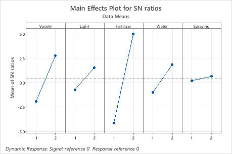
In these results, the main effects plot for S/N ratio indicates that Fertilizer has the largest effect on the signal-to-noise ratio. On average, experimental runs with Fertilizer 2 had much higher signal-to-noise ratios than experimental runs with Fertilizer 1. Spraying had a small effect or no effect on the signal-to-noise ratio.
Interaction plot
- If the lines are parallel to each other, then there is no interaction between the two factors.
- If the lines are not parallel to each other, then there is an interaction between the two factors.
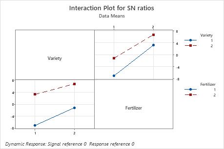
In these results, for the S/N ratios, the lines are close to parallel. Variety 2 has a higher S/N ratio than Variety 1 using both Fertilizer 1 and 2.
In addition to the interaction plots, examine the linear model analysis to determine whether the interaction is significant.
Scatterplot
- The least squares regression line through the reference point.
- The row number at the top of each plot, which refers to the first row in which the factor settings for that plot appear.
- The signal-to-noise ratio, slope, and standard deviation for the factor settings, which are located at the bottom of the plot.
The graphs are arranged in decreasing order of the signal-to-noise ratio, so that the experimental runs with the highest ratios are plotted first. If the experiment has more than nine combinations of factor settings, Minitab displays more than one graph of scatterplots.
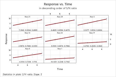
In this plot, there is a substantial difference in the spread of the data between the best and worst fits. For example, in the plot in the first cell, for row 21, the data are very close to the line. In the plot in the lower left corner, for row 9, the data vary much more widely. The standard deviation for row 21 is 0.4089, but is much larger in row 9. The standard deviation in row 9 is 1.1718.
Step 4: Determine whether your model meets the assumptions of the analysis
Use the residual plots to help you determine whether the model is adequate and meets the assumptions of the analysis. If the assumptions are not met, the model may not fit the data well and you should use caution when you interpret the results.
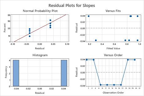
In these results, the residual plots show that there is only one degree of freedom for error, and only two distinct values of the residuals. It is likely that the model is overfit, with too many terms. In such a case, consider reducing the model, and reexamining the residual plots.
Normal probability plot of the residuals
Use the normal probability plot of the residuals to verify the assumption that the residuals are normally distributed. The normal probability plot of the residuals should approximately follow a straight line.
The patterns in the following table may indicate that the model does not meet the model assumptions.
| Pattern | What the pattern may indicate |
|---|---|
| Not a straight line | Nonnormality |
| A point that is far away from the line | An outlier |
| Changing slope | An unidentified variable |
Residuals versus fits plot
The patterns in the following table may indicate that the model does not meet the model assumptions.| Pattern | What the pattern may indicate |
|---|---|
| Fanning or uneven spreading of residuals across fitted values | Nonconstant variance |
| Curvilinear | A missing higher-order term |
| A point that is far away from zero | An outlier |
| A point that is far away from the other points in the x-direction | An influential point |
Use the residuals versus fits plot to verify the assumption that the residuals are randomly distributed and have constant variance. Ideally, the points should fall randomly on both sides of 0, with no recognizable patterns in the points.
Histogram of residuals
| Pattern | What the pattern may indicate |
|---|---|
| A long tail in one direction | Skewness |
| A bar that is far away from the other bars | An outlier |
Because the appearance of a histogram depends on the number of intervals used to group the data, don't use a histogram to assess the normality of the residuals.
A histogram is most effective when you have approximately 20 or more observations. If the sample is too small, then each bar on the histogram does not contain enough observations to reliably show skewness or outliers.
Residuals versus order plot
Trend
Shift