If your data exhibit overdispersion or underdispersion, a Laney attributes chart (a Laney P′ Chart or a Laney U′ Chart) may more accurately distinguish between common-cause variation and special-cause variation than a traditional attributes chart (for example, a P Chart or a U Chart). The calculations for the Laney attributes charts include Sigma Z, which is an adjustment for overdispersion or underdispersion. A Sigma Z value of 1 indicates that no adjustment is necessary and that the Laney attributes chart is exactly the same as a traditional attributes chart.
To create a Laney P' chart, choose . To create a Laney U' chart, choose .
What is overdispersion?
Overdispersion exists when data exhibit more variation than you would expect based on a binomial distribution (for defectives) or a Poisson distribution (for defects). Traditional P charts and U charts assume that your rate of defectives or defects remains constant over time. However, external noise factors, which are not special causes, usually cause some variation in the rate of defectives or defects over time.
The control limits on a traditional P chart or U chart become more narrow when your subgroups are larger. If your subgroups are large enough, overdispersion can cause points to seem to be out of control when they are not. For a Laney attributes chart, the definition of common cause variation includes not only the within-subgroup variation, but also the average variation between consecutive subgroups. If there is overdispersion, the control limits on a Laney attributes chart are wider than those of a traditional attributes chart.
The relationship between subgroup size and the control limits on a traditional attributes control chart is similar to that between power and a 1-sample t-test. With larger samples, the t-test has more power to detect a difference. However, if the sample is large enough, even a very small difference that is not of interest can become significant. For example, with a sample of 1,000,000 observations, a t-test may determine that a sample mean of 50.001 is significantly different from 50. However, a difference of 0.001 may have no practical implications for your process.
What is underdispersion?
Underdispersion is the opposite of overdispersion. Underdispersion exists when data exhibit less variation than you would expect based on a binomial distribution (for defectives) or a Poisson distribution (for defects). Underdispersion can occur when adjacent subgroups are correlated with each other, also known as autocorrelation.
When data exhibit underdispersion, the control limits on a traditional P chart or U chart may be too wide. If the control limits are too wide, you can overlook special-cause variation and mistake it for common-cause variation. If there is underdispersion, the control limits on a Laney attributes chart are narrower than those of a traditional attributes chart.
For example, as a tool wears out, the number of defects may increase. The increase in defect counts across subgroups can make the subgroups more similar than they would be by chance.
Comparing traditional attributes charts to Laney attributes charts
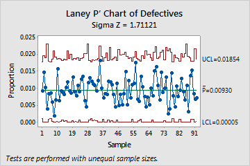
The following graphs show a traditional P chart and a Laney P' chart of the same data. These data are also featured in the example of the Laney P' Chart and the example of the P Chart Diagnostic. The subgroups are very large, with an average of about 2500 observations in each. Additionally, the P Chart Diagnostic test reveals overdispersion in the data.
The large subgroup sizes result in very narrow control limits on the traditional P chart. With the narrow control limits, the overdispersion causes several of the subgroups to appear out of control. The Laney P' chart, however, corrects for overdispersion and shows that the process is actually in control. No points fall outside of the control limits.
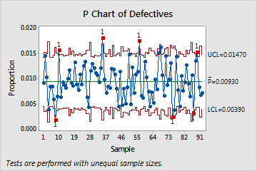
Traditional P chart