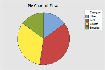
A quality engineer for an automotive supply company wants to decrease the number of car door panels that are rejected because of paint flaws. As part of the initial investigation, the engineer creates a pie chart to compare the counts of flaws in each category.
- Open the sample data, PaintFlaws.MWX.
- Choose .
- Select Chart counts of unique values.
- In Categorical variables, enter Flaws.
- Click OK.
Interpret the results
This pie chart shows that Peel is the most common paint flaw and that Smudge and Other are the least common paint flaws.
Note
If you want to change the order that the categories are displayed in the legend, you can change the value order of the categories. For more information, go to Change the display order of text values in Minitab output.