Use Individual Value Plot to assess and compare sample data distributions. An individual value plot shows a dot for the actual value of each observation in a group, making it easy to spot outliers and see distribution spread. An individual value plot works best when the sample size is less than approximately 50.
Like a boxplot, an individual value plot helps you to identify possible outliers and visualize the distribution of your data. However, unlike a boxplot, an individual value plot displays each value separately. Separate values are especially useful when you have relatively few observations or when it is important to assess the effect of each observation.
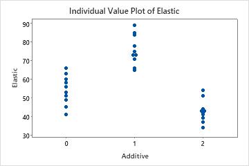
For example, an engineer creates an individual value plot to compare the elasticity of plastic samples made with different additives.
Where to find this graph
To create an individual value plot, choose .
When to use an alternate graph
An individual value plot works best when the sample size is less than approximately 50. If the sample is too large, the data points on the plot may be too densely packed together and the distribution may be difficult to assess. If the sample size is greater than 50, consider using a boxplot or a histogram instead.