Add or modify shaded regions
- Double-click the graph.
- Double-click the fitted distribution line.
- On the Shaded Area tab, in Define Shaded Area By, select either Probability or X value.
- Select the area of the plot that you want to shade and enter a value or values.
Examples of shaded areas
The following graphs model scores for an entrance exam into an education program. The scores are normally distributed with a known mean and standard deviation.
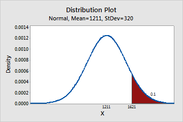
- Right tail
-
Students must score in the top 10 percent to be accepted into the program. The following graph shows that students who have scores of 1621 or greater are in the top 10 percent.
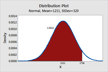
- Left tail
-
You received a score of 1738 and want to know your percentile. Your score of 1738 is at the 95th percentile.
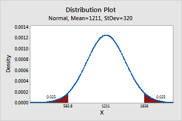
- Both tails
-
You want to know the scores at the 2.5th percentile and the 97.5th percentile. At the 2.5th percentile, the score is 583.8 and at the 97.5th percentile, the score is 1838. Approximately 95% of the students have scores that are between 583 and 1838.
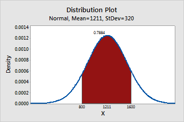
- Middle
-
You want to know what percentage of students has scores that are between 800 and 1600. Approximately 79% of the students have scores that are between 800 and 1600.
Display distributions in separate panels or graphs
By default, when you create a probability distribution plot with more than one distribution, Minitab overlays all of the distributions on the same graph. However, you can display each distribution in a separate panel or in a separate graph. As you create the plot, click Multiple Graphs and choose the desired option.
To use the same range on the x-axes or y-axes of each panel or graph, select the appropriate option under Same Scales for Graphs.
Change the appearance of lines and shaded regions
- Double-click the graph.
- Double-click the part of the graph to edit.
- Attributes: Change the attributes (type, color, and size) of the distribution line.
- Shading Attributes: Change the attributes of the region's border lines, and the type and color of the shading (fill) for the region.