What is a run chart?
A run chart represents your process data over time. Use a run chart to look for evidence of special-cause variation in your process.
Example of a run chart
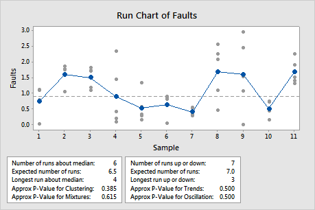
Except for one observation, the points vary randomly around the center line (median). The approximate p-values for clustering, mixtures, trends, and oscillation are all greater than the significance level of 0.05. Therefore, there is no indication of special-cause variation or non-randomness.
What do the points and center line on a run chart mean?
A run chart plots the individual observations in the order that they were collected. The gray points represent the individual values. The blue points represent either the subgroup means or subgroup medians.
- Plot subgroup means, the center line is the median of all the subgroup means and the blue plotted points are the subgroup means.
- Plot subgroup medians, the center line is the median of all the subgroup medians and the blue plotted points are the subgroup medians.
Note
If the subgroup size = 1, the center line is the median of all data, regardless of the option you select for the plotted points.
Even with skewed data, the median of the subgroup means is usually close to the median of the subgroup medians. The y-axis has a wide range because the raw data are also plotted, so the difference is usually not noticeable.
Run charts help detect special-cause variation
Variation occurs in all processes. Common-cause variation is a natural part of the process. Special-cause variation, comes from outside the system and causes recognizable patterns, shifts, or trends in the data. The run chart shows graphically whether special causes are affecting your process.
Run charts also provide tests for randomness that provide information about non-random variation due to trends, oscillation, mixtures, and clustering in your data. Such patterns indicate that the variation observed is due to special-cause variation.
Nonrandom patterns that a run chart can identify
There are four basic patterns of nonrandomness that a run chart will detect.
Mixture patterns
If the p-value for mixtures is less than 0.05, you may have mixtures in your data. In this chart, the mixture may indicate that the data come from different processes.
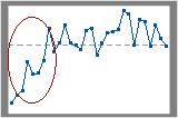
Cluster patterns
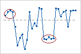
If the p-value for clustering is less than 0.05, you may have clusters in your data. In this case, the circled data may represent clusters of data.
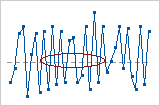
Oscillating patterns
If the p-value for oscillation is less than 0.05, you may have oscillation in your data. In this case, the circled data seem to vary up and down frequently.
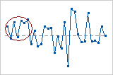
Trend patterns
If the p-value for trends is less than 0.05, you may have a trend in your data. In this case, the upward trend is circled and easily visible.