A quality engineer at a plant that assembles automobile engines monitors the movement of crankshafts in the engines. In an operating engine, parts of the crankshaft move up and down a certain distance from the baseline position. The engineer took five measurements per day from September 28 through October 15 and then 10 per day from October 18 through 25.
The quality engineer creates a CUSUM chart to monitor small shifts in the movement of the crankshafts.
- Open the sample data, CrankshaftMovement.MWX.
- Choose .
- From the drop-down list, select All observations for a chart are in one column, and enter A to B Distance.
- In Subgroup sizes, enter Date.
- Click OK.
Interpret the results
This example shows a tabular CUSUM: the upper CUSUM detects upward shifts in the level of the process and the lower CUSUM detects downward shifts. The upper CUSUM line shows that subgroups 4 through 10 fall outside the upper control limit, suggesting small shifts above the target.
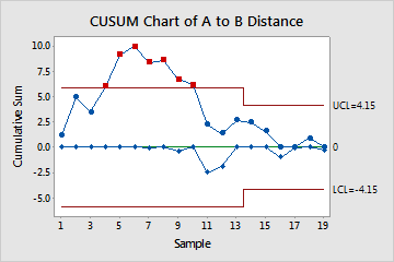
Test Results for CUSUM Chart of A to B Distance
| TEST. One point beyond control limits. |
|---|
| Test Failed at points: 4, 5, 6, 7, 8, 9, 10 |