Note
This command is available with the Predictive Analytics Module. Click here for more information about how to activate the module.
Use the Gain and Lift charts to assess the performance of your classification model. The Gain chart plots the total positive rate in percent versus the percent of total counts. The Lift chart plots the cumulative lift (or non-cumulative lift) versus the percent of total counts.
Interpretation of Gain chart
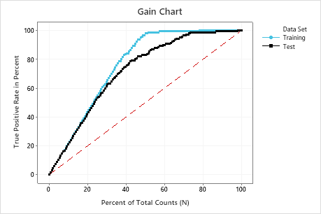
In this example, the gain chart shows a sharp increase above the reference line, then a flattening. In this case, approximately 40% of the data account for approximately 80% of the true positives. Thus, if a business targets the 20% of the population guided by the model, the percent of the true positive rate is about 40%. Without the model, the corresponding percent is 20%. This difference is the extra gain from using the model.
Interpretation of Lift chart
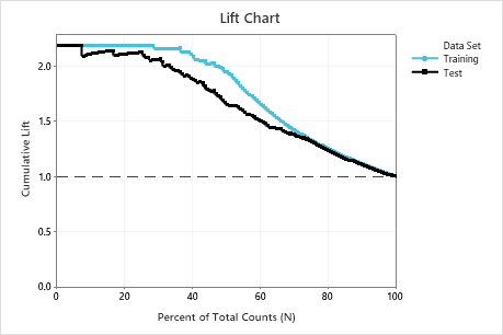
In this example, the lift chart shows a large increase above the reference line that gradually drops off. Thus, using this model, we can contact only 10% of customers but will reach more than twice as many respondents as if we use no model.