Use Contour Plot to examine the relationship between a response variable and two predictor variables. In a contour plot, the values for two predictor variables are represented on the x- and y-axes, and the values for the response variable are represented by shaded regions, called contours. A contour plot is like a topographical map in which x-, y-, and z-values are plotted instead of longitude, latitude, and altitude.
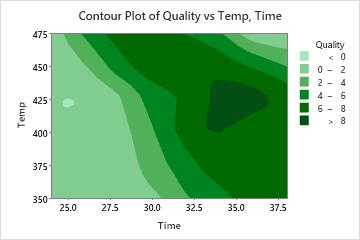
For example, the following contour plot shows the effect of temperature and time on the quality of reheated frozen entrees.
Where to find this graph
To create a contour plot, choose .