In This Topic
Step 1: Look for patterns in your data
Determine which model relationship best fits your data and assess the strength of the relationship.
Type of relationship
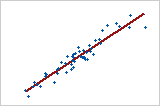
Linear: positive
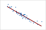
Linear: negative
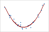
Curved: quadratic
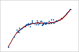
Curved: cubic
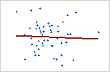
No relationship
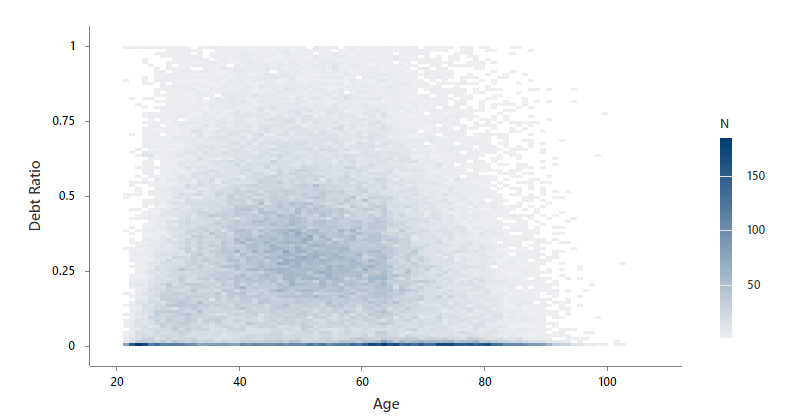
In this example, Minitab groups the data into rectangular bins. Minitab uses light gray to dark blue for the bins based on the number of observations that are in the bin. The economist sees that many people have a debt ratio close to 0 regardless of age, and very few people have a debt ratio close to 1. The darker region in the middle of the plot shows that debt ratio increases as age increases. However, when age is around 50, the darker region curves down and starts to decrease with age. Age and debt ratio appear to have a quadratic relationship. The economist decides that a regression model for debt ratio should include a second order term for age.
Step 2: Look for patterns with a third variable
If you include a third variable, look for a relationship between that variable and the x- and y- variables. Minitab colors bins based on the average value of the third variable for all the observations in that bin. If there is no relationship, the color of the bins will be randomly scattered throughout the binned scatterplot. A pattern in the colors indicates a relationship may exist.
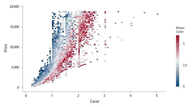
In this example, the research team wants to determine how the carat and color affect the price of diamonds. Minitab uses dark blue to dark red for the bins based on the color of the diamond. Darker shades of red correspond to higher values of the color variable. Darker shades of blue correspond to lower values of the color variable. The price increases as the number of carats increases. However, there is still a large variation in prices for diamonds with the same number of carats. The color of the diamond explains some of this variation. For diamonds with similar number of carats, a higher color number corresponds to a higher price.
Note
The color of a diamond is represented with a letter. Because all the variables must be numeric, the researchers codes the color of the diamond to a numeric scale that ranges from 0-6. The owner gives colorless diamonds a higher number and gives light yellow diamonds a lower number.
Step 3: Look for outliers
Outliers, which are data values that are far away from other data values, can indicate unusual conditions in your data and can strongly affect your results.
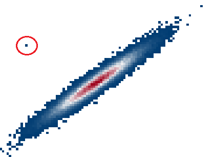
On a binned scatterplot, isolated bins can identify outliers.
Try to identify the cause of any outliers. Correct any data entry or measurement errors. Consider removing data values that are associated with abnormal, one-time events (special causes). Then, repeat the analysis.