In This Topic
Step 1: Determine whether the association between the response and the predictor variable is statistically significant
- P-value ≤ α: The association is statistically significant
- If the p-value is less than or equal to the significance level, you can conclude that there is a statistically significant association between the response variable and the predictor variable.
- P-value > α: The association is not statistically significant
- If the p-value is greater than the significance level, you cannot conclude that there is a statistically significant association between the response variable and the predictor variable.
Analysis of Variance
| Source | DF | Adj Dev | Adj Mean | Chi-Square | P-Value |
|---|---|---|---|---|---|
| Regression | 1 | 22.7052 | 22.7052 | 22.71 | 0.000 |
| Dose (mg) | 1 | 22.7052 | 22.7052 | 22.71 | 0.000 |
| Error | 4 | 0.9373 | 0.2343 | ||
| Total | 5 | 23.6425 |
Key Result: P-Value
In these results, the p-value for dose is 0.000, which is less than the significance level of 0.05. These results indicate that the association between the dose and the presence of bacteria at the end of treatment is statistically significant.
Step 2: Understand the effects of the predictors
Use the odds ratio to understand the effect of a predictor. Minitab calculates odds ratios when the model uses the logit link function.
Odds ratios that are greater than 1 indicate that the event is more likely to occur as the predictor increases. Odds ratios that are less than 1 indicate that the event is less likely to occur as the predictor increases.
Odds Ratios for Continuous Predictors
| Unit of Change | Odds Ratio | 95% CI | |
|---|---|---|---|
| Dose (mg) | 0.5 | 6.1279 | (1.7218, 21.8087) |
Key Result: Odds Ratio
In these results, the model uses the dosage level of a medicine to predict the presence or absence of bacteria in adults. Each pill contains a 0.5 mg dose, so the researchers use a unit change of 0.5 mg. The odds ratio is approximately 6. For each additional pill that an adult takes, the odds that a patient does not have the bacteria increase by about 6 times.
Use the fitted line plot to examine the relationship between the response variable and the predictor variable.
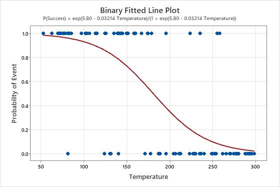
Key Result: Binary Fitted Line Plot
In these results, the equation is written as the probability of a success. The response value of 1 on the y-axis represents a success. The plot shows that the probability of a success decreases as the temperature increases. When the temperatures in the data are near 50, the slope of the line is not very steep, which indicates that the probability decreases slowly as temperature increases. The line is steeper in the middle portion of the temperature data, which indicates that a change in temperature of 1 degree has a larger effect in this range. When the probability of a success approaches zero at the high end of the temperature range, the line flattens again.
Step 3: Determine how well the model fits your data
To determine how well the model fits your data, examine the statistics in the Model Summary table. For binary logistic regression, the data format affects the deviance R2 statistics but not the AIC. For more information, go to How data formats affect goodness-of-fit in binary logistic regression.
- Deviance R-sq
-
The higher the deviance R2, the better the model fits your data. Deviance R2 is always between 0% and 100%.
Deviance R2 always increases when you add additional predictors to a model. For example, the best 5-predictor model will always have an R2 that is at least as high as the best 4-predictor model. Therefore, deviance R2 is most useful when you compare models of the same size.
For binary logistic regression, the format of the data affects the deviance R2 value. The deviance R2 is usually higher for data in Event/Trial format. Deviance R2 values are comparable only between models that use the same data format.
Deviance R2 is just one measure of how well the model fits the data. Even when a model has a high R2, you should check the residual plots to assess how well the model fits the data.
- Deviance R-sq (adj)
-
Use adjusted deviance R2 to compare models that have different numbers of predictors. Deviance R2 always increases when you add a predictor to the model. The adjusted deviance R2 value incorporates the number of predictors in the model to help you choose the correct model.
- AIC, AICc, and BIC
- For Binary Fitted Line Plot, you can use the information criteria to compare the fit of different link functions or different predictors. Smaller values are desirable. However, the model with the least value does not necessarily fit the data well. Also use test and residual plots to assess how well the model fits the data.
Model Summary
| Deviance R-Sq | Deviance R-Sq(adj) | AIC | AICc | BIC | Area Under ROC Curve |
|---|---|---|---|---|---|
| 96.04% | 91.81% | 10.63 | 14.63 | 10.22 | 0.9398 |
Key Results: Deviance R-Sq, Deviance R-Sq (adj), AIC
In these results, the model explains 96.04% of the deviance in the response variable. For these data, the Deviance R2 value indicates the model provides a good fit to the data. If additional models are fit with different predictors, use the other values to compare how well the models fit the data.
Step 4: Determine whether your model meets the assumptions of the analysis
Use the residual plots to help you determine whether the model is adequate and meets the assumptions of the analysis. If the assumptions are not met, the model may not fit the data well and you should use caution when you interpret the results.
For more information on how to handle patterns in the residual plots, go to Graphs for Binary Fitted Line Plot and click the name of the residual plot in the list at the top of the page.
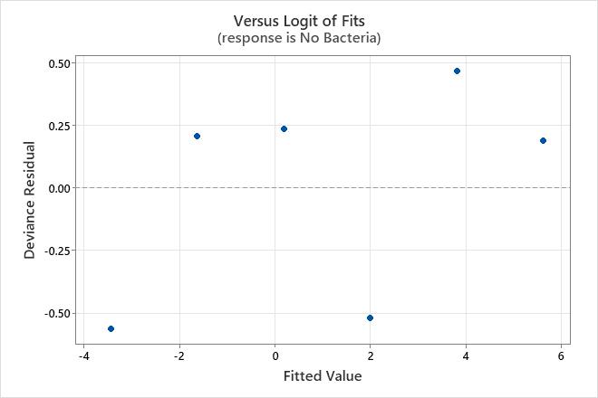
Residuals versus fits plot
Use the residuals versus fits plot to verify the assumption that the residuals are randomly distributed. Ideally, the points should fall randomly on both sides of 0, with no recognizable patterns in the points.
The residuals versus fits plot is only available when the data are in Event/Trial format.
| Pattern | What the pattern may indicate |
|---|---|
| Fanning or uneven spreading of residuals across fitted values | An inappropriate link function |
| Curvilinear | A missing higher-order term or an inappropriate link function |
| A point that is far away from zero | An outlier |
| A point that is far away from the other points in the x-direction | An influential point |
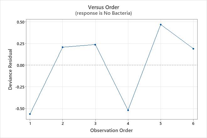
Residuals versus order plot
Trend
Shift
Cycle