To create a pie chart, complete the steps for the option that best describes your data.
Chart counts of unique values
Select this option if you have a column of categorical data where each row is an observation. In Categorical variables, enter one or more columns of categories that you want to graph. By default, Minitab creates a separate graph for each variable.
In this worksheet, Flaws is the categorical variable. The graph shows the counts for each type of paint flaw.
| C1-T |
|---|
| Flaws |
| Scratch |
| Scratch |
| Peel |
| ... |
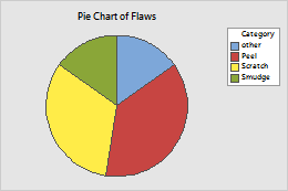
Chart values from a table
Complete the following steps if you have a column of summarized data and a corresponding column of categories.
- In Categorical variable, enter a column of categories that you want to graph. In the following worksheet, Job Classifications is the column with the category names.
- In Summary variables, enter one or more columns of summary values that you want to graph.
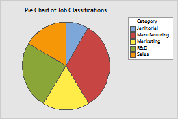
In this worksheet, Job Classifications is the categorical variable, and Counts is the summary variable. The graph shows the counts of job classifications.
| C1-T | C2 |
|---|---|
| Job Classifications | Counts |
| R&D | 36 |
| Sales | 24 |
| Janitorial | 12 |
| Marketing | 25 |
| Manufacturing | 48 |