For most graphs, you can use a frequency column to summarize data counts for the graph variables. With this data format, each variable column contains unique values or labels listed only once and a corresponding frequency column that indicates the number of occurrences of each item or value.
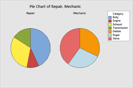
For example, this worksheet contains the frequency column Rep_Freq to tally each type of automobile repair and the frequency column Mech_Freq to tally the repairs by each mechanic. The pie charts display the summarized frequency data.
| C1-T | C2 | C3-T | C4 |
|---|---|---|---|
| Repair | Rep_Freq | Mechanic | Mech_Freq |
| Exhaust | 15 | Steve | 20 |
| Body | 22 | Roger | 14 |
| Transmission | 8 | Debbie | 16 |
| Engine | 5 |
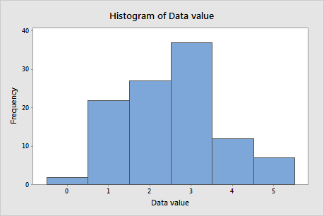
In this worksheet, Frequency indicates the number of occurrences of each numerical value in the data set. The histogram plots the summarized frequency data.
| C1 | C2 |
|---|---|
| Data value | Frequency |
| 0 | 2 |
| 1 | 22 |
| 2 | 27 |
| 3 | 37 |
| 4 | 12 |
| 5 | 7 |
To use frequency columns when you create a graph, click Data Options. On the Frequency tab, enter the column or columns that contain the frequency data. You can designate a different frequency column for each graph variable that you enter on the main dialog box. Minitab matches the order of the frequency columns that you enter with the order of the corresponding variables on the graph main dialog box.
Note
If you use a frequency column with scatterplots, matrix plots, and 3D scatterplots, the jitter functionality does not reveal overlapping points. For more information on jitter, go to Symbols and dots. Frequency values are included in calculations for fitted regression lines and smoother lines.