A nutrition consulting company created an education program to increase the calcium intake in children ages 9 to 13. To measure the effectiveness of the program, an analyst performs an experiment in which 200 children are assigned randomly to either the control group (no education) or the education group. The average daily dietary calcium intake is calculated from 3-day diet records.
The analyst creates an empirical CDF plot to examine the distribution of calcium intake for each group. The analyst wants to know in particular the calcium intake values that fall below the 50th percentile for each group.
- Open the sample data, CalciumIntake.MWX.
- Choose .
- In Graph variables, enter Calcium.
- In Categorical variables for grouping (0-3), enter Group.
- Click OK.
- Right-click the graph and choose .
- In Show percentile lines at Y values, enter 50.
- Click OK.
- Hold your pointer over points on the connect line to see the actual data values (x) and percentiles (y).
Interpret the results
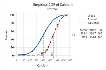
The data points for both groups closely follow the fitted normal distribution lines. The percentile lines show that approximately 50% of the children in the control group have calcium intake values of at least 808, while 50% of the children in the education group have calcium intake of at least 1113.
By moving the pointer along the connect lines, the analyst sees that a calcium intake of 1000 is approximately the 76th percentile for the control group and approximately the 25th percentile for the education group. Therefore, approximately 76% of the children in the control group and 25% of the children in the education group have a calcium intake of less than 1000.
Note
For information on options for fitted distributions lines, go to Fitted distribution lines.