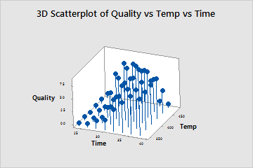
A food scientist wants to determine the optimal time and temperature for heating a frozen dinner. The scientist prepares 14 samples at various times and temperatures, and then has professional food tasters rate each sample for overall quality. The scientist creates a 3D scatterplot to examine the results.
- Open the sample data, FrozenDinnerPrep.MWX.
- Choose .
- In Z variable, enter Quality.
- In Y variable, enter Temp.
- In X variable, enter Time.
- Click Data View. Under Data Display, select Project Lines.
- Click OK in each dialog box.
Interpret the results
Heating the dinner at shorter time intervals results in under-cooked product and low quality scores. However, heating at the longest intervals combined with the highest temperatures also results in low scores because the food becomes over-cooked. The optimal settings appear to be between 400° and 450° and between approximately 30 and 36 minutes.
Tip
Adding project lines helps you visualize each point's position in three-dimensional space. Rotate the graph to view the plot from different angles and explore possible relationships in the data. For more information, go to Select display options for 3D Scatterplot and 3D Surface Plot.