Note
This command is available with the Predictive Analytics Module. Click here for more information about how to activate the module.
The scatterplot shows the actual response values on the x-axis and the fitted response values on the y-axis. The calculated line represents when the actual value and the response value are equal. Outliers or unusual clusters of points in the test data can indicate data that deserve more investigation.
If you add validation with a test set to validation with the out-of-bag data, then Minitab displays results for both validation methods.
Interpretation
Ideally, the line goes through the middle of the points and the points are close to the line, relative to the scale of the response variable.
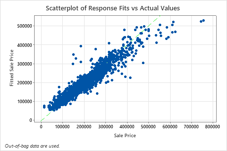
The scatterplot of fitted sale price versus actual sale price shows the relationship between the fitted and actual values for the out-of-bag data. You can hover over the points on the graph to see the plotted values more easily.