Use a symmetry plot to determine whether sample data come from a symmetric distribution. A distribution is symmetric if data on both sides of the median are distributed the same way; that is, the tails of the distribution are mirror images. Many statistical procedures assume that data come from a normal distribution. However, many statistical procedures are robust to violations of normality, so having data from a symmetric distribution is often adequate. Other procedures, such as nonparametric methods, assume symmetric distributions instead of normal distributions. Therefore, a symmetry plot is useful in many circumstances.
A symmetry plot graphs the upper distance of the median on the x-axis vs. the lower distance to the median on the y-axis, for each data point. A reference line on the plot represents a perfectly symmetric sample. Compare the data points to the line to assess the degree of symmetry present in your data. The more symmetric the data, the closer the points will be to the line. A histogram is also displayed so that you can see the shape of the distribution.
Example of a symmetry plot
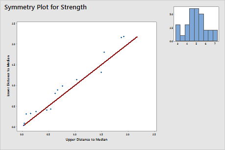
The histogram in the right corner is an approximate bell-shaped curve. The data seem to follow the reference line, indicating a symmetric distribution.