What is a Pareto chart?
A Pareto chart is a special type of bar chart where the plotted values are arranged from largest to smallest. Use a Pareto chart to identify the most frequently occurring defects, the most common causes of defects, or the most frequent causes of customer complaints.
The Pareto chart is named for Vilfredo Pareto and his principle of the "80/20 rule." That is, 20% of the people control 80% of the wealth; or 20% of the product line may generate 80% of the waste; or 20% of the customers may generate 80% of the complaints, and so on.
Example of a Pareto chart
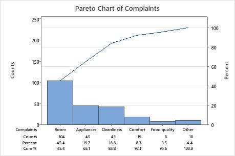
Usually the left y-axis is frequency of occurrence, and the right y-axis is the cumulative percentage of the total number of occurrences. The x-axis displays the categories of defects, complaints, waste, and so on.
What is a weighted Pareto chart?
A weighted Pareto chart not only considers the frequency of occurrence, but the importance as well. A weighted Pareto chart can plot the severity of the defects, or the cost, or anything else you would like to track. For example, suppose you have 5 coating defects that you are tracking: wrinkles, stains, scratches, dirt specks, and bubbles.
You collect data on the frequency of defect occurrence and the cost to rework. A weighted Pareto chart may change your priority for improvement projects by considering data based on both cost and frequency data. For example, even though wrinkles may be more frequent they are less expensive to repair than dirt specks, which are a rarer occurrence. Considering both cost and frequency will give you a better understanding of your cost of poor quality (COPQ).
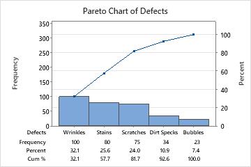
Pareto chart that considers frequency only
The most frequently occurring defects are wrinkles and stains. Based only on this information, you may decide to develop an improvement project to decrease the amount of wrinkles and stains.
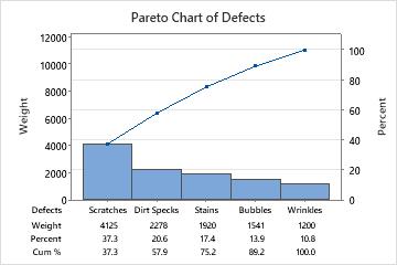
Weighted Pareto chart that considers cost and frequency
The most costly defects are scratches and dirt specks. Based on this more informative data, you decide it is better to develop an improvement project to decrease the number of scratches and dirt specks.
Things to consider when you use a Pareto chart
- Data collected during a short period of time, especially from an unstable process, may lead to incorrect conclusions. Because the data may not be reliable, you may get a misleading idea of the distribution of defects and causes. When the process is not in control, the causes may be unstable and the vital few problems may change from week to week. Short periods of time may not be representative of your process as a whole.
- Data collected during long periods of time may include changes. Examine the data for stratification or changes in the problem distribution over time.
- Choose categories carefully. If your initial Pareto analysis does not yield useful results, you may want to ensure that your categories are meaningful and that your "other" category is not too large.
- Choose weighting criteria carefully. For example, cost may be a more useful measure for prioritization than number of occurrences, especially when the costs of various defects differ.
- Concentrating on the problems with the highest frequency should decrease the total number of items needing rework. Concentrating on the problems with the highest cost should increase the financial benefits of the improvement.
- The goal of a Pareto analysis is to obtain maximum reward from the quality efforts, but that doesn't mean that small, easily solved problems should be ignored until the larger problems are solved.