Use an Xbar Chart
to monitor the mean of your process when you have continuous data in subgroups. Xbar charts
monitor process stability over time so that you can identify and correct instabilities in a
process.
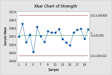
For example, a plastics manufacturer wants to determine whether the production process for a new product is in control. Analysts collect subgroups of 5 units every hour for 20 hours and assess the strength of the plastic.
The points vary randomly around the center line and are within the control limits. No trends or patterns are present. The strength of the plastic product is stable across the 20 subgroups.
Note
The process variation must be in control before you assess the process center using a Xbar chart because the control limits for the Xbar chart are calculated using the within-subgroup variation. If the process variation is not in control, then the Xbar chart control limits are not reliable and Minitab might produce a false out-of-control signal. Use an R or S chart to assess whether the process variation is in control.
Where to find this control chart
To create an Xbar chart, choose Stat > Control Charts > Variables Charts for Subgroups > Xbar.