In This Topic
- About symbols
- Add symbols to a graph
- Change the size, color, or type of symbols
- Change the default color, type, and size of symbols
- Use jitter and offset to reveal overlapping points
- Change the jitter or offset options
- Specify the offset options when you create a graph with command language
- Dots on dotplots
About symbols
You can add symbol displays to some graphs that don't display them by default; for example, add a mean symbol to an individual value plot or add individual symbols to an interval plot. You can edit the type, color, and size of all symbols on a graph, groups of symbols on a graph, or an individual symbol.
Symbols represent individual values
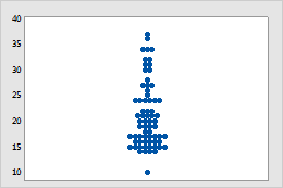
Individual value plot
Each symbol represents a single observation, for example, an apple circumference.
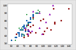
Scatterplot
Minitab displays a different type of symbol (shape and color) for each group. For example, on this scatterplot of apple circumference vs weight, the four types of symbols represent four varieties of apples.
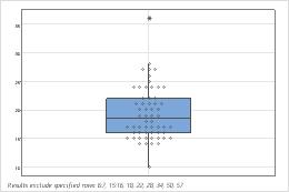
Boxplot
Individual symbols have been added to this boxplot of apple circumferences. Outlier symbols (*) appear by default for boxplots.
Symbols represent summary values
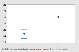
Interval Plot
Symbols on this interval plot represent the mean apple circumferences for two orchards.
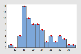
Histogram
Symbols were added to this histogram of apple circumferences to emphasize the frequency for each bin.
Add symbols to a graph
If your graph does not have symbols by default, you can add them. To add symbols when you create a graph, click Data View. To add symbols to an existing graph, use the following steps:
- Double-click the graph.
- Right-click the graph and choose .
Change the size, color, or type of symbols
- Double-click the graph.
-
Select the symbols that you want to change:
- Click a symbol one time to select all points.
- If the graph has groups, click the symbol a second time to select only those points within the group.
- Click one more time to select the individual symbol.
For more information on selecting symbols, go to Select groups and single items on a graph.
- Right-click the graph and choose .
- On the Attributes tab, select Custom and choose the new Type, Color, and Size.
- Click OK.
Change the default color, type, and size of symbols
You can change the default attributes for symbols to use when creating new graphs.
- To change the default size, color, and type of symbols when groups are not represented by different symbols, choose and make the changes.
- To change the way symbol attributes are cycled when groups are represented by different symbols, choose and choose Symbol Types or Symbol and Line Colors.
Use jitter and offset to reveal overlapping points
If you have identical data values on your graph, symbols could hide behind each other. Jitter and offset symmetrically are options that move symbols slightly to reveal overlapping points.
Jitter is available for symbols on scatterplots, matrix plots, bubble plots, 3D scatterplots, individual value plots, interval plots, and boxplots; and for outliers on boxplots. Offset symmetrically is available for symbols on individual value plots, interval plots, and boxplots; and for outliers on boxplots. You can turn off jitter and offset symmetrically for all graphs that include them.
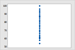
No jitter or offset symmetrically
Identical data points are drawn at the same location, so that symbols are behind each other.
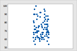
Jitter
Randomly nudges all symbols on a graph. Because jitter relies on a random function, jittered plots are not the same each time you generate them.
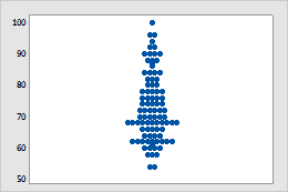
Offset symmetrically
Moves overlapping symbols in the x-direction symmetrically from the center. Graphs using this option will look the same each time they are generated.
Change the jitter or offset options
- Double-click the graph.
- Double-click a symbol and click the Identical Points or Jitter tab.
- Change the offset or jitter options.
- Click OK.
Specify the offset options when you create a graph with command language
You can also specify the offset when creating the graph with command language. For example, if you want to create an individual value plot of the data in C1, use the following subcommands to specify the offset method:
-
To create a graph with no offset, submit these session commands:
INDPLOT C1; NOJITTER. -
To create a graph with jitter, submit these session commands:
INDPLOT C1; JITTER. -
To create a graph with points offset symmetrically, submit the
following session commands:
INDPLOT C1; SOFFSETNote
Symmetrical offset is the default, so the
soffsetsubcommand is optional.
Dots on dotplots
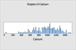
To edit dots, select and double-click the dots that you want to edit. For more information on selecting dots, go to Select groups and single items on a graph.
- Edit the appearance of the dots
-
On the Attributes tab, you can edit the type, color, and size of the selected dots.
- Stack or unstack the groups
-
(Not available with marginal plots) If the dotplot has groups, on the Options tab, select Stack dots of innermost categorical variable to stack the groups.
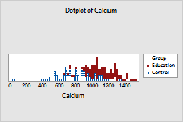
Stacked groups
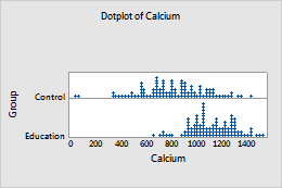
Unstacked groups
- Change the stacking order of the groups
- (Not available with marginal plots) Minitab stacks the groups based on
the value order of the grouping column. For more information, go to
Change
the display order of text values in Minitab output. On the
Options
tab, select the stacking order for the groups.
- Top of stack
- The first group is on the top of the stack, the second group is under the first, and so on.
- Bottom of stack
- The first group is on the bottom of the stack, the second group is on top of the first, and so on.