Enter the x- and y-variables, define the gradient, select the scales to make similar, and enter the by variables.
In This Topic
Enter the Y-variable and X-variable
You can graph the x and y-variables as individual pairs or you can graph every combination of the x-y variables. The y-variable is the variable that you want to explain or predict. The x-variable is a corresponding variable that might explain or predict changes in the y-variable. All columns must be numeric, and each x-y variable pair must have the same number of rows.
X-Y pairs
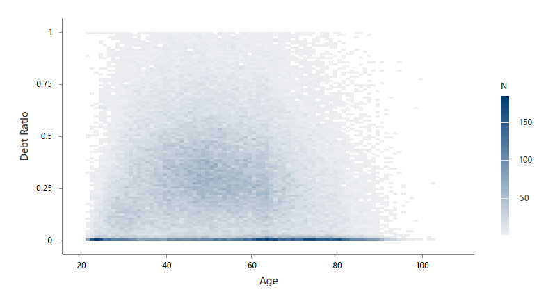
Select to display a separate graph for each pair of x and y-variables that you enter. In this worksheet, Debt Ratio is the y-variable and Age is the x-variable. The graph shows the relationship between debt ratio and age.
| C1 | C2 |
|---|---|
| Age | Debt Ratio |
| 45 | 0.80298 |
| 40 | 0.12188 |
| 38 | 0.08511 |
| ... | ... |
Each Y versus each X
Select to display a separate graph for each possible combination of x and y-variables that you enter. In this worksheet, Debt Ratio is the y-variable and Age and Income are the x-variables. Minitab creates two graphs, one that shows the relationship between debt ratio and age and another that shows the relationship between income and age.
| C1 | C2 | C3 |
|---|---|---|
| Age | Debt Ratio | Income |
| 45 | 0.80298 | 45,000 |
| 40 | 0.12188 | 75,000 |
| 38 | 0.08511 | 52,000 |
| ... | ... | ... |
Select what the gradient is defined by
Select how you want to define the color scale of the bins on the binned scatterplot.
- Frequency of binned data
- Select to define the gradient scale by the number of observations in the bin.
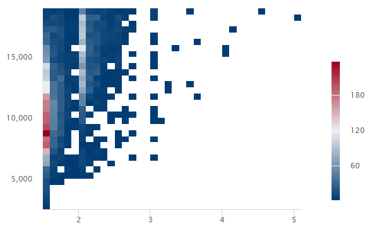
In this example, bins with 180 observations or more are dark red. Bins with 60 observations or fewer are dark blue. Bins with between 60 and 180 observations are lighter shades of blue, red, and gray.
- Mean of variable
- Select to define the gradient scale by the value of a third variable.
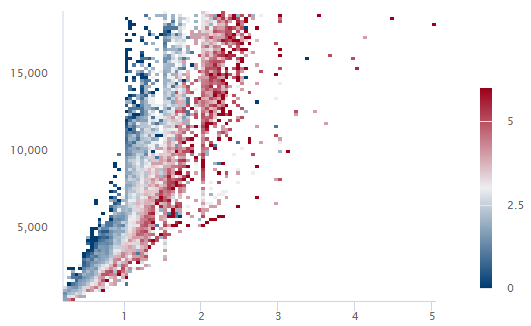
In this example, when the average value of all observations of the third variable is greater than 5, the bin is dark red. When the average value of all observations of the third variable is less than 1, the bin is dark blue. Bins with average values between 1 and 5 are lighter shades of blue, red, and gray.
Select the scales to make similar
- Same X-scale
- Use the same x-scale across all graphs.
- Same Y-scale
- Use the same y-scale across all graphs.
Enter the By variables
- Show all combinations
When you enter multiple By variables, Minitab enables the Show all combinations checkbox. Select this option to create a separate binned scatterplot for each combination of groups created by the By variables. If you do not select this option, Minitab creates a plot for each group of each By variable.
For example, the first By variable has 2 groups, Male and Female, and the second By variable has 2 groups, Employed and Unemployed. If you select Show all combinations, Minitab creates 4 separate plots for the combinations of Male/Employed, Male/Unemployed, Female/Employed, and Female/Unemployed. If you do not select Show all combinations, Minitab creates 4 separate plots for Male, Female, Employed, and Unemployed.