A stock broker compares the monthly performance of two stocks during the past two years. The stock broker creates a time series plot to visualize the performance of the two stocks.
- Open the sample data, StockPrice.MWX.
- Choose or .
- In Series, enter 'Company A' and 'Company B'.
- Click Time/Scale.
- Under Time Scale, select Calendar, and then select Month.
- Click OK in each dialog box.
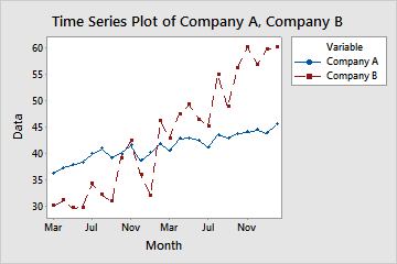
Interpret the results
The solid line for Company A shows a slow increase over the two-year period. The dashed line for Company B also shows an overall increase for the two years, but it fluctuates more than that of Company A. Company B starts lower than Company A, but Company B surpasses Company A by April.