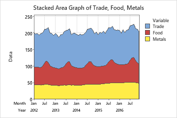
An employment analyst studies the trends in employment in three industries across five years (60 months). The analyst creates an area graph to evaluate overall employment trends as well as individual trends for the three industries.
- Open the sample data, EmploymentTrends.MWX.
- Choose .
- In Series, enter Trade, Food, and Metals.
- Click Time/Scale.
- Under Time Scale, select Calendar, and then select Month Year.
- Under Month, enter 1. Under Year, enter the year when the data starts. In this example, the data start in 2012.
- Click OK in each dialog box.
Interpret the results
Employment for the Metals industry (bottom line) was fairly flat. Employment for the Food industry (summed with Metals as center line) demonstrates a cyclic pattern, peaking around August. Overall, combined employment for the Food and Metals industries did not change appreciably over the five years.
Combined employment for all industries (top line) also demonstrated a cyclic pattern, with peaks around August and February. The August peaks are at least partially due to the cyclical employment in the Food industry. Overall, combined employment for all industries together increased over the five years, reflecting an increase mostly in Trade employment.