Equivalence plot
An equivalence plot displays the equivalence limits, the confidence interval for equivalence, and the decision about whether you can claim equivalence.
Interpretation
Use the equivalence plot to view a graphical summary of the equivalence test results and to determine whether you can claim equivalence.
Compare the confidence interval with the equivalence limits. If the confidence interval is completely within the equivalence limits, you can claim that the mean of the test population is equivalent to the mean of the reference population. If part of the confidence interval is outside the equivalence limits, you cannot claim equivalence.
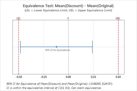
In these results, the 95% confidence interval is completely within the equivalence interval defined by the lower equivalence limit (LEL) and the upper equivalence limit (UEL). Therefore, you can conclude that the test mean is equivalent to the reference mean.
Subject profile plot
Shows the response to the reference treatment and the test treatment for each participant in the study. One plot is shown for each sequence in the study.
Interpretation
Use the subject profile plot to examine the responses of each participant to the test treatment and the reference treatment.
Compare the responses of the subjects in each sequence. Verify that the overall pattern is consistent with the equivalence test results. Identify any subjects whose response is markedly inconsistent with the other responses, which could affect the overall results.
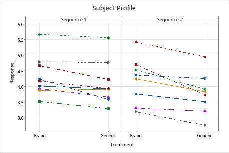
This subject profile plot shows the stomach acid (pH) of each study participant after receiving a brand-name antacid and a generic antacid. Generally, most participants had a lower pH in response to the generic antacid, especially in sequence 2. A few participants in sequence 1 appear to have had approximately the same response using the brand-name and the generic antacid.
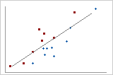
Period plot
The period plot shows Period 1 responses on the x-axis plotted against Period 2 responses on the y-axis. Each sequence is represented by a different symbol. The diagonal line shows where the x-values and the y-values are equal, for example, where x = 4 and y = 4.
Interpretation
Use the period plot to look for evidence of treatment effects, period effects, and sequence effects.
Look for the following patterns.
- Most points for one sequence are above the line and most points for the other sequence are below the line
- This pattern indicates a possible treatment effect. The response to the test treatment is different than the response to the reference treatment.
- Most points for one sequence appear in the lower left of the graph and most points for the other sequence appear in the upper right of the graph
- This pattern indicates a possible sequence effect. The responses are generally higher for one sequence than for the other sequence.
- Most points for both sequences appear on the same side of the line
- This pattern indicates a possible period effect. The responses are generally higher for one period than for the other period.
- The points for both sequences are scattered randomly on the graph
- This pattern indicates that there is no effect of treatment, sequence, or period. The responses are generally the same regardless of these factors.
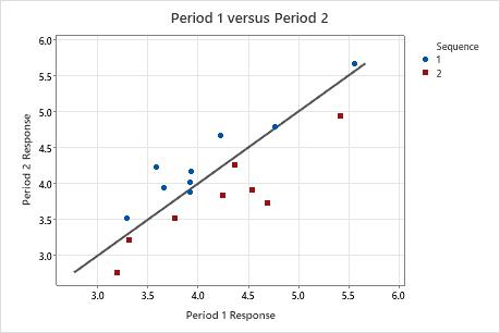
In this period plot, most points for sequence 1 are above the line and most points for sequence 2 are below the line. This pattern indicates a possible treatment effect.
Sequence by period mean plot
The sequence by period mean plot shows the mean response for each period of each sequence.
Interpretation
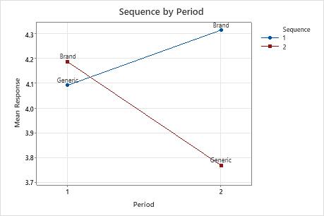
In this period sequence plot, the mean response to the generic drug was lower in both sequences. The effect appears to be greater in sequence 2 than in sequence 1.
CAUTION
The means shown in the plot are based on samples rather than on entire populations. To determine whether any effects are statistically significant, examine the p-values in the Effects table. For more information, go to Effects for Equivalence Test for a 2x2 Crossover Design and click P-value for the effects.