In This Topic
Analysis of means chart for data that follow the normal distribution
Use the analysis of means chart for normally distributed data to determine whether the main effects and interaction effects in your data are statistically significant. Based on the number of factors in your design, the chart displays either one main effects plot, or two main effects plots and an interaction effects plot.
- Interaction effects plot
-
Use the interaction effects plot to test the null hypothesis that there is no interaction between the factors. Minitab displays an interaction effects plot only when your data include two factors.
The interaction effects plot displays the average measurement for each combination of factor levels. Minitab plots the center line at zero, which represents no interaction effect. The decision limits are calculated based on your data and the significance level you specify. With a two-way analysis of means, assess the interaction effects first. If the interaction effects are statistically significant, you cannot interpret the main effects without considering the interaction effects.
Use the decision limits to test the hypotheses for interaction effects as follows:- If one or more effects are outside the decision limits, you can conclude that the interaction effect between the two factors is statistically significant. Identifying the points that are beyond the decision limits may help you interpret the interaction.
- If no effects are outside the decision limits, you cannot reject the null hypothesis. There is insufficient evidence to conclude that there is an interaction effect.
- Main effects plot
-
Use the main effects plot to test the null hypothesis that the population mean for each factor level is equal to the mean of the overall population at the significance level you specify. Minitab displays one main effects plot for each factor.
The main effects plot displays the average measurement of each factor level. The center line is the overall average for all of the samples. The decision limits are calculated based on your data and the significance level you specify. Use the decision limits to test the hypotheses for main effects as follows:- If a sample mean is outside the decision limits, you can reject the null hypothesis and conclude that the difference between the group mean and the overall mean is statistically significant.
- If a sample mean is within the decision limits, you cannot reject the null hypothesis. There is insufficient evidence to conclude that the group mean and overall mean are different.
If the factor levels all have the same number of observations, the decision limits are straight lines. If the levels do not all have the same number of observations, the decision limits change with the level.
Key Results: Main effects plot, Interaction effects plot
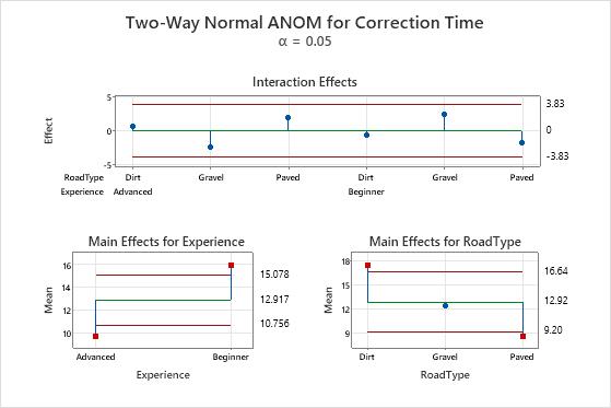
In this plot, the interaction effects are well within the decision limits, which indicates that the interaction effects are not statistically significant. Next, assess the main effects. The lower two plots show the means for the levels of the two factors. The main effect is the difference between the mean and the center line.
In the main effects plot for experience, the points that represent the factor level means for both the advanced and beginner experience are outside the decision limits. This condition indicates that the difference between each of these means and the overall mean is statistically significant. You can conclude that advanced drivers have a significantly lower mean correction time and beginner drivers have a significantly higher mean correction time.
Similarly, in the main effects plot for road type, the main effects for dirt and paved roads are outside the decision limits, which indicates that these main effects are statistically significant. However, the main effect for gravel roads is not statistically significant.
Analysis of means chart for binomial data
Use the analysis of means chart for binomial data to identify unusually large or small proportions.
- If a sample proportion is located beyond a decision limit, you can reject the null hypothesis and conclude that the difference between the group proportion and the overall proportion is statistically significant.
- If a sample proportion falls within the decision limits, you cannot reject the null hypothesis. There is insufficient evidence to conclude that the group proportion and the overall proportion are different.
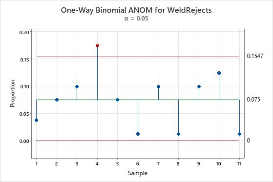
Key Result: One-Way Binomial ANOM plot
In this plot, the proportion of defective welds in sample 4 is above the decision limits. The difference between the proportion of defective welds in this group and the overall proportion is statistically significant.
Analysis of means chart for Poisson data
Use the analysis of means chart for Poisson data to identify unusually large or small rates of occurrence.
- If a rate of occurrence is above or below a decision limit, you can reject the null hypothesis and conclude that the difference between the group rate of occurrence and the overall rate of occurrence is statistically significant.
- If a sample mean falls within the decision limits, you cannot reject the null hypothesis. There is insufficient evidence to conclude that the group rate of occurrence and overall rate of occurrence are different.
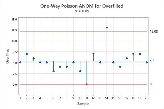
Key Result: One-Way Poisson ANOM plot
In this plot, the 11th machine has an overfill count of 0, which is unusually small. The 14th machine has an overfill count of 13, which is unusually large. The manager schedules diagnostic work for the 14th machine to rule out any mechanical problems.