In This Topic
Step 1: Assess the key characteristics
Examine the peaks and spread of the distribution. Assess how the sample size may affect the appearance of the histogram.
Peaks and spread
Identify the peaks, which are the tallest clusters of bars. The peaks represent the most common values. Assess the spread of your sample to understand how much your data varies.
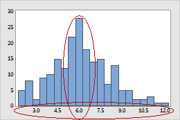
Investigate any surprising or undesirable characteristics on the histogram. For example, the histogram of customer wait times showed a spread that is wider than expected. An investigation revealed that a software update to the computers caused delays in customer wait times.
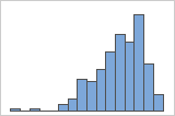
Sample size (n)
The sample size can affect the appearance of the graph.
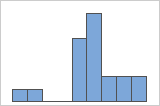
n = 20
n = 100
A histogram works best when the sample size is at least 20. If the sample size is too small, each bar on the histogram may not contain enough data points to accurately show the distribution of the data. The larger the sample, the more the histogram will resemble the shape of the population distribution. If the sample size is less than 20, consider using an Individual value plot instead.
Step 2: Look for indicators of nonnormal or unusual data
Skewed data and multi-modal data indicate that data may be nonnormal. Outliers may indicate other conditions in your data.
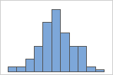
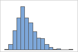
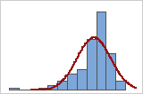
Skewed data
When data are skewed, the majority of the data are located on the high or low side of the graph. Skewness indicates that the data may not be normally distributed.
These histograms illustrate skewed data. The histogram with right-skewed data shows wait times. Most of the wait times are relatively short, and only a few wait times are long. The histogram with left-skewed data shows failure time data. A few items fail immediately, and many more items fail later.
Right-skewed
Left-skewed
If you know that your data are not naturally skewed, investigate possible causes. If you want to analyze severely skewed data, read the data considerations topic for the analysis to make sure that you can use data that are not normal.
Outliers
Outliers, which are data values that are far away from other data values, can strongly affect your results. Often, outliers are easiest to identify on a boxplot.
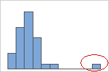
Try to identify the cause of any outliers. Correct any data entry or measurement errors. Consider removing data values that are associated with abnormal, one-time events (special causes). Then, repeat the analysis.
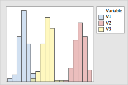
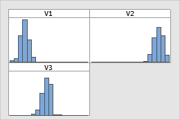
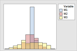
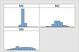
Multi-modal data
Multi-modal data have more than one peak. (A peak represents the mode of a set of data.) Multi-modal data usually occur when the data are collected from more than one process or condition, such as at more than one temperature.
For example, these histograms are graphs of the same data. The simple histogram has two peaks, but it is not clear what the peaks mean. The histogram with groups shows that the peaks correspond to two groups.
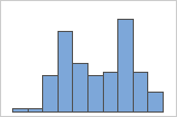
Simple
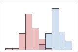
With Groups
If you have additional information that allows you to classify the observations into groups, you can create a group variable with this information. Then, you can create the graph with groups to determine whether the group variable accounts for the peaks in the data.
Tip
To add a group variable to an existing graph, double-click a data representation in the graph and then click the Groups tab.
Step 3: Assess the fit of a distribution
If your histogram has a fitted distribution line, evaluate how closely the heights of the bars follow the shape of the line. If the bars follow the fitted distribution line closely, then the data fits the distribution well.
Note
For information on how to specify different distributions and parameters, go to Fitted distribution lines.
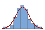
Good fit
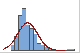
Poor fit
For a more precise measurement of the distribution fit, use a probability plot to check the fit for statistical significance.
Step 4: Assess and compare groups
If your histogram has groups, assess and compare the center and spread of groups.
Centers
Look for differences between the centers of the groups.
Overlaid histograms
Paneled histograms
- Use a 2-sample t test if you have only two groups.
- Use a one-way ANOVA if you have three or more groups.
Spreads
Look for differences between the spreads of the groups.
Overlaid histograms
Paneled histograms
- Use a 2 variances test if you have only two groups.
- Use a test for equal variances if you have three or more groups.