In This Topic
- Show or hide scale elements
- Transpose the value scale and the category scale
- Innermost and outermost scales on a graph
- Remove some of the innermost category labels
- Change the space between the groups
- Include empty groups on the scale
- Change the tick mark labels and axis labels
- Same scale range for all panels
Show or hide scale elements
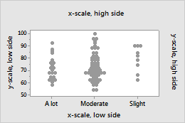
Graph scale elements are axis lines, axis labels, tick marks, and tick labels. You can display these elements on the high side or the low side of the graph's data region.
- Double-click the graph.
- Double-click the scale to open the Edit Scale dialog box.
- On the Show tab, select the elements to show.
Transpose the value scale and the category scale
- Double-click the graph.
- Double-click the scale to open the Edit Scale dialog box.
- On the Scale tab, select Transpose value and category scales.
Default position of scales
Transposed scales
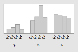
Innermost and outermost scales on a graph
Minitab uses the terms "innermost" and "outermost" to indicate the relative position of the scales for multiple levels of groups displayed on a graph.
For a horizontal scale, outermost refers to the scale at the bottom of the graph, and innermost refers to the scale farthest from the bottom, closest to the horizontal axis.
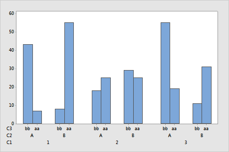
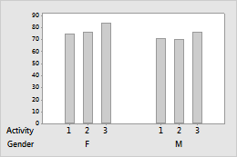
In this bar chart, C1 is the outermost scale and C3 is the innermost scale.
Outermost is also sometimes referred to as Level 1. The scale directly above the Level 1 scale is the Level 2 scale, and so on.
For a vertical scale, outermost refers to the scale to the far left, and innermost refers to the scale closest to the vertical axis.
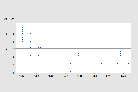
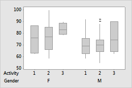
In this dotplot, C1 is the outermost scale and C2 is the innermost scale.
When you create a graph with grouping variables, the order that you enter the variables in the dialog box determines which variables are defined as innermost or outermost. Minitab uses the first variable that you enter as the outermost variable. The subsequent scale levels then follow the order of the variables.
Remove some of the innermost category labels
- Double-click the graph.
- Double-click the scale to open the Edit Scale dialog box.
- On the Scale tab, under Ticks for Innermost Displayed Category Labels, deselect Auto for Tick start or Tick increment, then specify the settings.
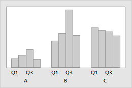
Tick increment = 2
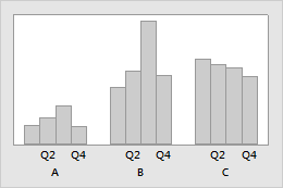
Tick increment = 2 and Tick start = 2
Change the space between the groups
- Double-click the graph.
- Double-click the scale to open the Edit Scale dialog box.
- On the Scale tab, under Space Between Scale Categories, you can specify the following:
- Gap within clusters
- To specify the space between items in a cluster, deselect Auto, then enter a gap.
- Gap between clusters
- To specify the space between clusters, deselect Auto, then enter a gap.
Gap within clusters=0, Gap between clusters=1.5
Gap within clusters=1, Gap between clusters=5
Include empty groups on the scale
- Double-click the graph.
- Double-click the scale to open the Edit Scale dialog box.
- On the Scale tab, deselect Include empty cells.
| C1-T | C2 | C3 |
|---|---|---|
| Group | Subgroup | Data |
| A | 1 | 55 |
| B | 1 | 41 |
| B | 2 | 29 |
| C | 1 | 44 |
| C | 2 | 33 |
Change the tick mark labels and axis labels
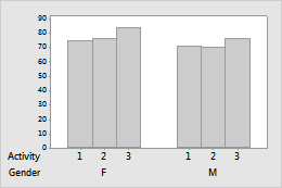
Multi-level scale
- Double-click the graph.
- Double-click the scale to open the Edit Scale dialog box.
- Select the tab to make the edits that you want.
- Labels: Deselect Auto, and enter the custom labels, separated by spaces.
- Font: You can edit the font for the tick mark labels.
- Alignment: You can change the angle of tick mark labels.
Default tick mark labels
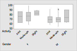
Custom tick mark labels
Tip
You can also use to change coded values in the worksheet to values that are more descriptive. For more information, go to Overview for Recode.
Single-level scale
- Double-click the graph.
- Double-click the scale to open the Edit Scale dialog box.
- Select the tab to make the edits that you want.
- Labels Select Specified and enter the custom labels, separated by spaces.
- Font: You can edit the font for the tick mark labels.
- Alignment: You can change the angle of tick mark labels.
- Double-click the graph.
- Double-click the axis label to open the Edit Axis Label dialog box.
- Select the tab to make the edits that you want.
- Font: Edit the text, and the font.
- Alignment: Specify the text angle and the position relative to the default location.
- Show: Specify the location on the graph where you want the label to display.
Same scale range for all panels
- Double-click the graph.
- Double-click the scale to open the Edit Scale dialog box.
- On the Scale tab, selectSame scale range for all panels to standardize the range for the selected scale for all plots in the matrix plot.