About 3D scatterplots and 3D surface plots
Use a 3D scatterplot to explore the potential relationships among three variables. When you create a 3D scatterplot, you usually display predictor variables on the x-axis and the y-axis and the response variable on the z-axis. For example, you may want to examine how temperature and humidity affect the drying time of paint, or how horsepower and tire pressure affect a vehicle's fuel efficiency.
Use a 3D surface plot to examine the relationship between a response variable (Z) and two predictor variables (X and Y), by viewing a three-dimensional surface of the predicted response. You can choose to represent the predicted response as a smooth surface or a wireframe.
Choose data display elements
The following images show elements that you can display on a 3D graph. To select elements when you create the graph, click Data View.
- Double-click the graph.
- Right-click the graph and choose .
Note
For information on adding or changing the grouping variables for an existing graph, go to Display groups on graphs.
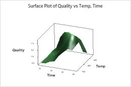
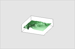
3D surface plot with surface
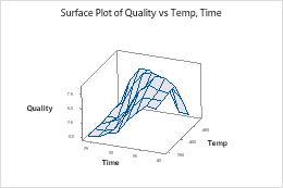
3D surface plot with wireframe
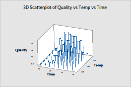
3D scatterplot with symbols and project lines
Note
For more information on editing these graph features, including how to change a surface plot to a wireframe plot, go to the following topics.
Edit the 3D box
- Double-click the graph.
- Right-click the graph and choose .
- Change the box appearance
-
On the Attributes tab, you can edit the fill type, fill color, line type, line color, and line size. For example, on the following 3D scatterplot, the 3D box is colored light yellow.
- Display box faces
-
On the Box Options tab, select one of the following options:
None
Back faces only
All faces
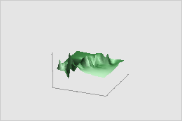
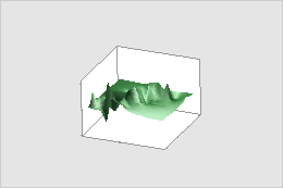
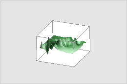
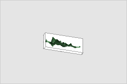
- Change the aspect ratio
-
On the Box Options tab, select a ratio. For example, the following 3D surface plots are all of the same data.
Default
Proportional to data ranges
Specified (this plot: 3 x 3 x 1)
Rotate a 3D graph
You can rotate a 3D graph to view them from different angles. This allows you to more thoroughly explore the relationships among the variables. Use the buttons on the toolbar in graph editing mode to rotate 3D graphs. These buttons appear when a 3D scatterplot or a 3D surface plot is active.
- Double-click the graph.
- Use the following buttons on the toolbar to rotate the graph. Click each button once to rotate the graph in small increments. Click and hold a button for continuous rotation.
Toolbar item Action 
Rotate the graph clockwise or counterclockwise about the x-axis. 
Rotate the graph clockwise or counterclockwise about the y-axis. 
Rotate the graph clockwise or counterclockwise about the z-axis. Note
When you click a button, a preview window pops up to show exactly how the graph will spin.
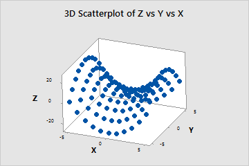
Original 3D scatterplot
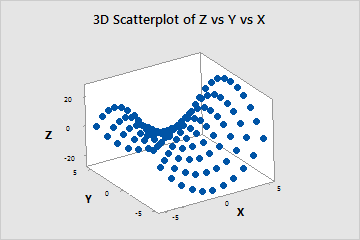
Rotated 3D scatterplot
Specify the surface type
You can select between a solid surface and a wireframe.
- Double-click the graph.
- Double-click the surface pattern.
- On the Attributes tab, select one of the following options:
Surface

Wireframe
Edit the surface pattern
You can specify the surface color, wire color, and wire size.
- Double-click the graph.
- Double-click the surface pattern.
- On the Attributes tab, you can specify the surface color for a 3D surface plot, or the surface color, wire color, and wire size for a wireframe plot.
Note
For information on how to change the appearance of the mesh of a surface plot by using different methods to interpolate between values, go to Mesh.