An economist wants to examine the relationship between debt ratio and age. The economist collects financial data from more than 100,000 different people. Because the dataset is so large, the economist creates a binned scatterplot.
- Open the sample data, Debt.MWX.
- Choose .
- In Y-variable, enter Debt Ratio.
- In X-variable, enter Age.
- From Gradient type, select Sequential from low to high.
- Click OK.
Interpret the results
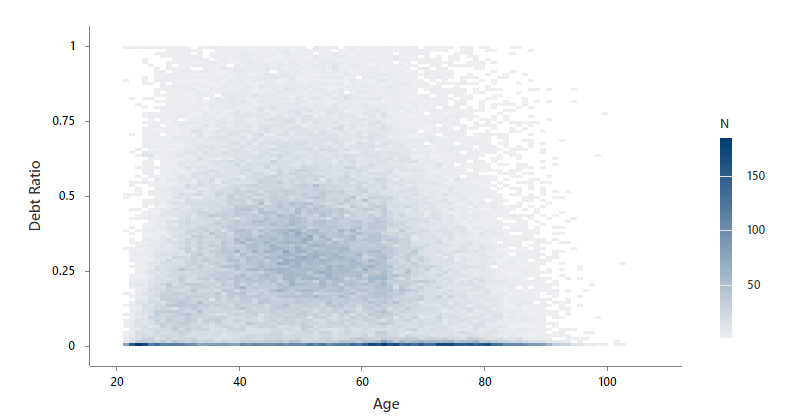
Minitab groups the data into rectangular bins. Minitab uses light gray to dark blue for the bins based on the number of observations that are in the bin. The economist sees that many people have a debt ratio close to 0 regardless of age, and very few people have a debt ratio close to 1. The darker region in the middle of the plot shows that debt ratio increases as age increases. But when age hits a value around 50, the darker region curves down and starts to decrease with age. The economist decides that a regression model for debt ratio should include a second order term for age.