A research team for a large jewelry retailer wants to investigate the relationship between carat, color, and price of various diamonds. A scatterplot is difficult to interpret because the data set is so large. Thus, the team decides to create a binned scatterplot to make it easier to interpret the graph.
Note
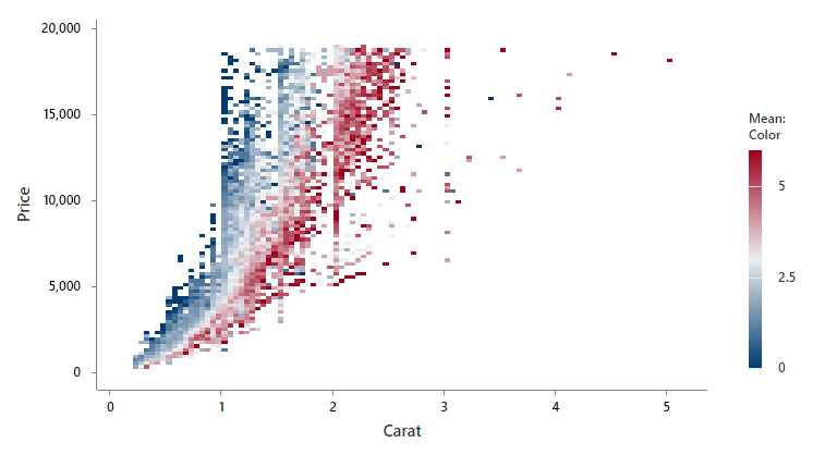
Usually, the color of a diamond is represented with a letter. Because all the variables must be numeric, the researchers code the color of the diamond to a numeric scale that ranges from 0-6. The researchers gives colorless diamonds a higher number and gives light yellow diamonds a lower number.
- Open the sample data, Diamonds.MWX.
- Choose .
- In Y-variable, enter Price.
- In X-variable, enter Carat.
- Select Mean of variable and enter Color in the box.
- Click OK.
Interpret the results
Minitab groups the data into rectangular bins. Minitab uses dark blue to dark red for the bins based on the color of the diamond. Darker shades of red correspond to higher values of the color variable. Darker shades of blue correspond to lower values of the color variable. The research team wants to determine how the carat and color affect the price. The price of the diamond increases as the number of carats increases. However, there is still a large variation in prices for diamonds with the same number of carats. The color of the diamond explains some of this variation. For diamonds with the same number of carats, a higher color number corresponds to a higher price.